
February 6, 2025
Looker Studio Tutorial for Google Analytics 4
Updated: February 6th, 2026
Since Google Analytics 4’s data visualization options are limited, more GA4 users are turning to Looker Studio (not to be confused with Looker) for their data visualization needs.
Looker Studio is a tool for creating customized dashboards and reports, providing the flexibility to analyze data in more depth. It provides a user-friendly drag-and-drop interface for building interactive reports without writing any code.
In this Looker Studio tutorial for Google Analytics 4, we will go through the process of creating a dashboard in LS, starting with why and how to connect your data to an example of a simple report you can make today.
Yes, I know that the dashboard below is ugly. But we will be focusing on the functionality here, not on the design.

Follow along to learn how to harness the full potential of your GA4 data and gain valuable insights to drive informed decision-making!
Table of Contents
Here’s what you will learn in this article
- Why connect GA4 to Looker Studio?
- How to connect GA4 to Looker Studio
- Overview of the interface
- Building your first report
- Limitations
- Hot tips
- Looker vs. Looker Studio vs. Looker Studio Pro
- Final Words
Youtube tutorial
If you prefer video content, here’s a tutorial from my YouTube channel.
Why connect GA4 to Looker Studio?
Suppose you’ve just gotten familiar with Explorations in Google Analytics 4. In that case, you may be trying to determine whether the benefits of using Looker Studio outweigh the costs of learning yet another tool.
| Feature | GA4 Standard Reports |
Looker Studio |
| Customization | Limited (Pre-defined cards) | High (Full canvas control) |
| Data Sources | GA4 Data Only | Data from multiple sources (GA4, Ads, Sheets, etc.) |
| Sharing | Read-only access within GA4 (explorations). Custom reports (in the reports section) are visible to all property users by default. | Scheduled emails, PDF downloads, Public links |
| Visualizations | Basic charts | Advanced (Pivot tables, Community visualizations) |
That’s totally fair; learning a new tool – especially one with so many features – can feel daunting, but rest assured that there are some great benefits to doing it!
So, why connect GA4 to Looker Studio?
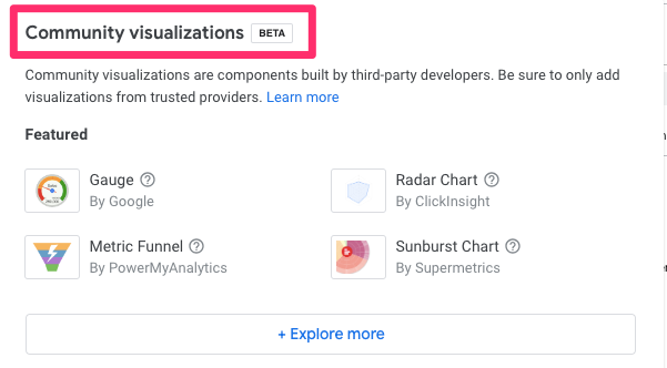
- Looker Studio contains more visualization options compared to the GA4 interface, which you can combine on a single page to create a comprehensive dashboard or across a multi-page report. There are built-in visualizations, like pivot tables and treemaps (not available in GA4), and visualizations built by the community that you can download (currently in Beta).

- Looker Studio makes it easy to access data, particularly for those unfamiliar with navigating the GA4 interface who just want a straightforward way to view their analytics. Perhaps leveraging Looker Studio to create curated reports will increase the number of people in your company actually exploring the data and choosing to make data-driven decisions.
- GA4 is missing features that Looker Studio can replace, like views (not to be confused with the Views metric in GA4). In GA4, there are “some” limited workarounds for views (I explain them in my GA4 course), but nothing is a perfect replacement. Looker Studio can be used as one of the workarounds.
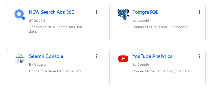
- You can connect multiple data sources to Looker Studio, allowing you to visualize your GA4 and Google Ads data alongside other relevant data sources (e.g. MySQL, YouTube Analytics, etc.) so you can have a unified reporting solution.

- Unlike GA4 explorations, you can collaborate on reports with others in Looker Studio! This can save you time by enabling you to work with others to create and update a report without needing to work within your own copy.
How to connect GA4 to Looker Studio
Alright, now that you know the why of Looker Studio, let’s get into the how – starting with how to connect your GA4 data (and any other data) to Looker Studio.
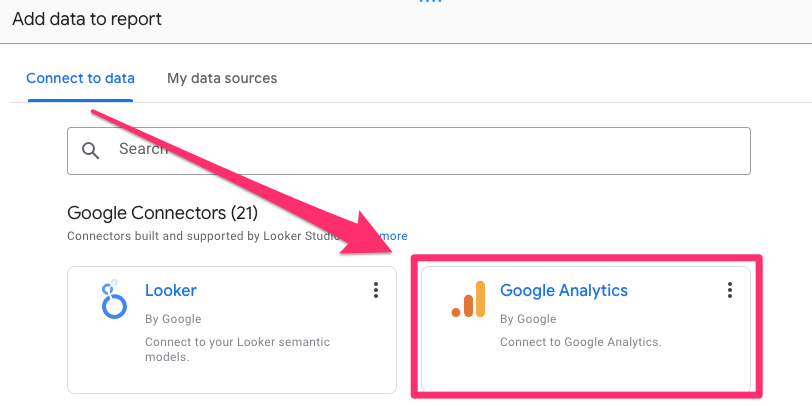
Click this link to go to the Looker Studio site. You will be prompted to add data to your report, so select “Google Analytics”.
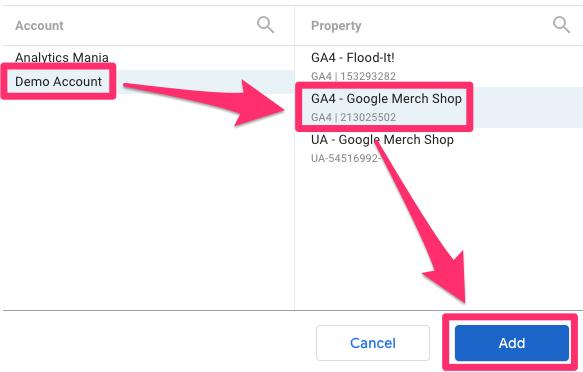
Select the GA4 property and account for which you want to create a report and click “Add”. In this tutorial, I will use the “GA4 – Merch Shop” demo property, which you can also use to practice or connect your data right away).
Let’s get into the fun stuff!
Overview of the interface
There are many features of Looker Studio that you can look forward to learning, but let’s just run through a quick overview of some features you will use most often. As you get familiar with the interface, I encourage you to click through everything to know what it does. You should also stay updated on the Looker Studio release notes to learn about new features!
| Element | Location |
Function |
| Canvas | Center | The drag-and-drop area where you build your visualizations. |
| Toolbar | Top | Contains tools to add pages, charts, controls, and images. |
| Data Panel | Right Sidebar | Lists all available Dimensions (green) and Metrics (blue). |
| Properties Panel | Right Sidebar | Controls the Setup (data configuration) and Style (colors/fonts) of a selected chart. |
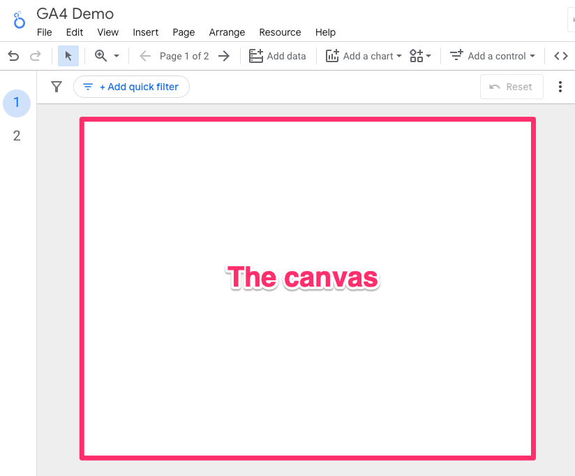
Canvas
The canvas is the area where you will create your dashboards and reports. You can add everything from text and images to various visualizations to the canvas and move it around.
To change the size of the canvas in two ways. First, to just update the individual page, go to Page in the toolbar and click “Current page settings”.
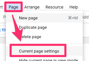
This will open up a new tab on the right side. Click “Style”, and at the bottom, you will find the settings to update the width (left to right) and height (top to bottom) of the report.
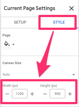
If you want to set the canvas size for the entire report, go to Themes and layout on the right side of the toolbar and select the “Layout” tab.
As in the page settings, you will see the settings for width and height, which will set the canvas size for all report pages (existing and new).
Data
The Data tab shows an overview of the dimensions and metrics in your data set for any data sources you’ve added to your report.
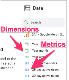
Dimensions are attributes of your data that provide context or describe the characteristics of users, sessions and events, e.g. event name, device type, page URL, etc. Metrics are measurements or numerical values that quantify your data, e.g. views, event count, users, etc.
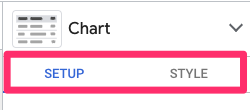
Properties
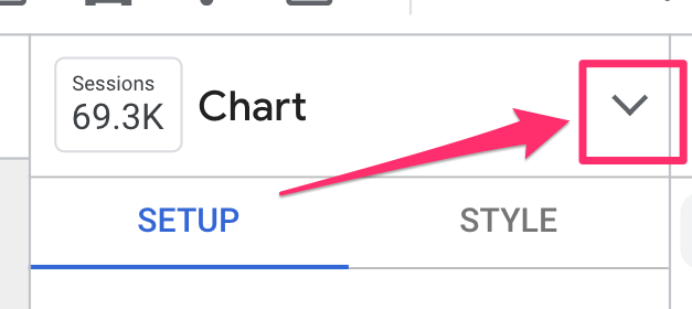
The Properties tab lets you customize the individual charts of your report. This tab is split into two parts: Setup and Style (you need to click on a chart for this tab to populate).
Setup: The Setup section is the more technical aspect of your chart related to the data being displayed, so this will include things like what dimensions and metrics you want it to display, how to sort the data, the data range and any chart-level filters.
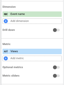
You can also include “optional” metrics, which won’t display in the default version of the chart, but the viewer can toggle them to be included.
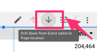
Or, you can add a drill down on the dimension (e.g., if you have a chart with the Event name, you could add Page location and see the pages on which the event occurred when you click on a specific event).
Style: The Style section is more about the appearance of the chart. Looker Studio is quite customizable, so you can change things like the colors, fonts (size and type), whether your table displays just a number, bar or heatmap (for the metrics) and much more (go through each section and change things to see how it can impact your chart).
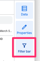
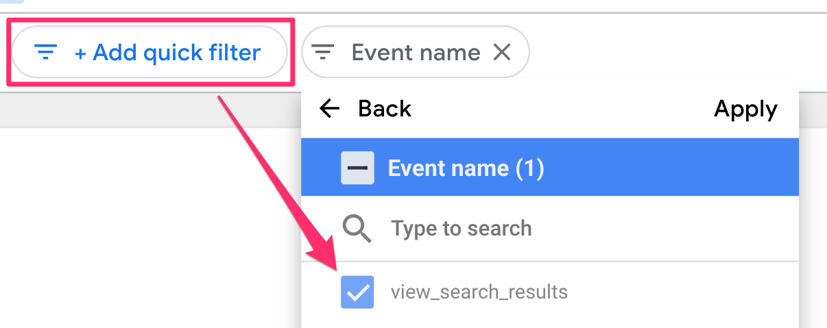
Filter bar
The Filter bar lets you easily create a temporary report-level filter. Enable it by clicking the “Filter bar” on the right side of the interface.
This will not have any lasting effect on the report, so it’s nice if you just want to test something quickly and not permanently change it (even if you publish the report with the filter enabled).
Toolbar
The toolbar runs along the top of the canvas and contains plenty of features you will constantly use while creating reports. Some specific elements to call out in the toolbar are:
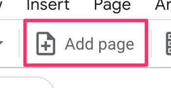
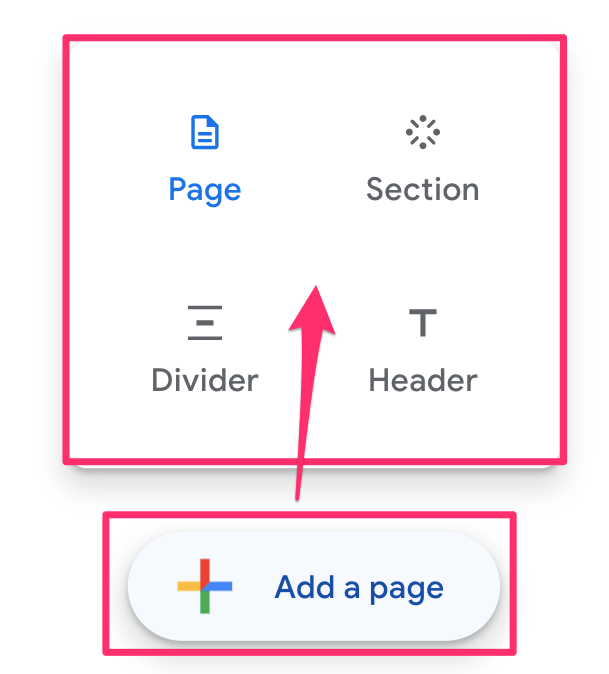
Add page: A single report can contain up to 100 pages.
Once you have more than one page, this will change to say something like “Page 1 of 2”, and if you click this, it will open up the Report Pages tab where you can add sections, pages, dividers and headers.
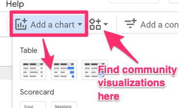
Add a chart: You can add many charts to your report, from a simple scorecard, table or time series chart to visualizations built by other community members (which you can find by clicking the shapes icon next to “Add a chart”).
Add a control: Controls are different types of filters (e.g. date range or a filter on a dimension) and buttons (e.g. navigation or report actions, like “Download report”) that you can add to your report.
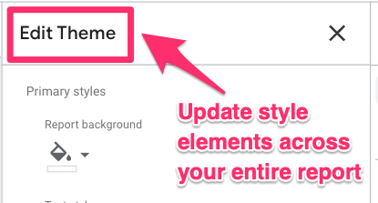
Theme and layout: This section is cool because it lets you build a style template for your report, which makes it easier to maintain a consistent design across your report.
You can choose the size of your report, what colors and fonts to use for charts and text, and even the width of bar charts. There is plenty to customize, so take some time to figure out what you want your reports to look like.
Share
Looker Studio provides multiple ways to share and send your reports.
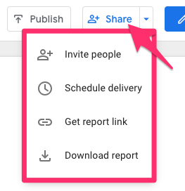
Invite people: invite others using their email as either a Viewer (can only view reports and update things like the optional metrics or filters) or an Editor (can edit the report)
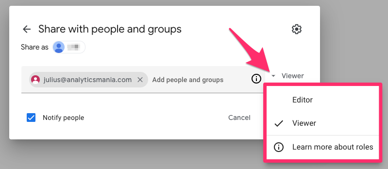
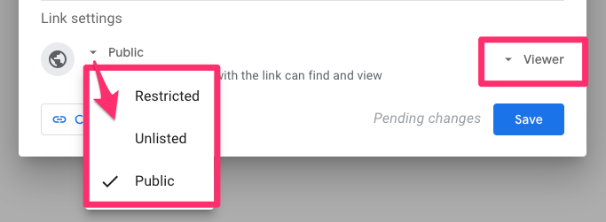
You can also change the privacy settings of your report link, making it more or less available to people and the roles that a user who clicks the link will have.
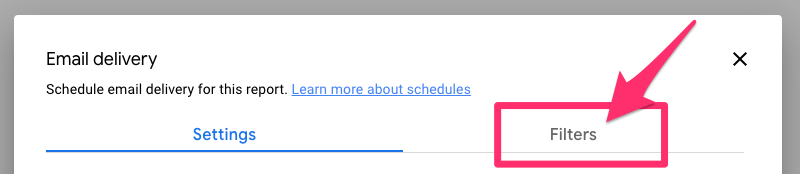
Schedule delivery: Set up a scheduled email delivery to send this report to users within or outside your organization at a specified cadence. You can also add a filter to the email schedule for any filters used in the report.
Get report link will provide you with the link to your report (based on the privacy setting defined in the “Invite people” settings).
Embed report will provide you with a code snippet that you can add to the code on your site to embed the report.
Download report will download a PDF of your report (you can select all or some of the pages).
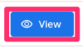
View/Edit
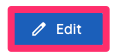
If you want to see what a viewer of your report sees, you can click the “View” button to switch from the edit mode to view mode.
This will turn into an “Edit” button when you are in view mode to get back to editing your report.
To reiterate, Looker Studio has many features compared to the GA4 Explorations, so this was not a comprehensive list of all the features, but just some to get you started with your journey.
Even the most seasoned Looker Studio users will continue to find things they didn’t know previously existed, so take some time to explore everything available.
Building your first report
The following tutorial will give you a basic dashboard, which presents an overview of your site’s analytics data. This is a super simple one-page report that doesn’t represent all Looker Studio can do, but hopefully, it will inspire you to start thinking about the different types of reports you can build to fit your business needs!
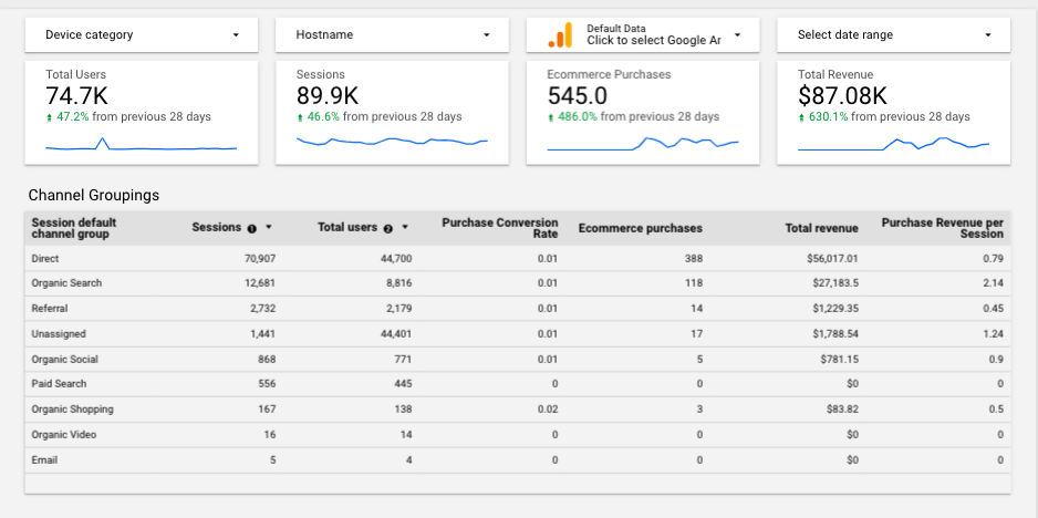
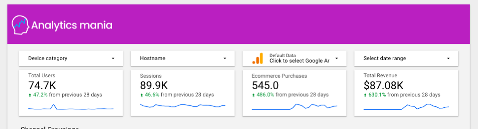
The report we build will contain an overview of some essential metrics on users, sessions and purchases and a more detailed view of these metrics per channel grouping. Some filters and custom styling will be added to further tailor the report to your needs.
Stay tuned for some limitations and tips after the tutorial!
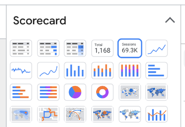
Add scorecard
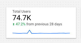
Scorecards are an excellent way to quickly see the status of important metrics like total users and revenue. You can choose from two types of scorecards: the regular scorecard or the compact scorecard. As the name suggests, the compact scorecard shows a compact number, which is simpler to read.
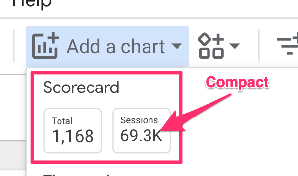
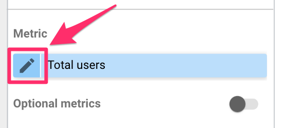
Select the one that suits your needs better; if you don’t need to know the exact number, then opt for the compact scorecard. In the Properties tab, change the metric to Total users.
If you want to change the metric’s name, click the pencil icon next to it.
In the Properties tab again, scroll down to the Comparison date range section. Here, you can choose if you want your scorecard to show the difference in value between the current date range and a previous one. In this case, select “Previous period” and click “Apply”.
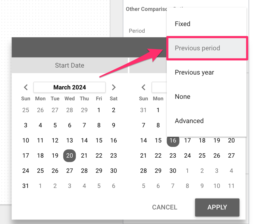
If your date range is the previous 28 days, the previous period will be the 28 days before the first date in your range.
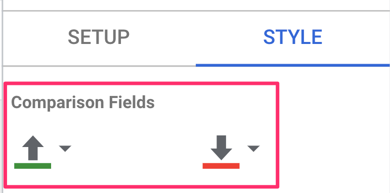
When you add the comparison period, it just gives a percentage value on the scorecard, which isn’t very clear to someone just viewing the report. To add a label, go to the Style tab, find where it says “Hide comparison label”, and uncheck it.
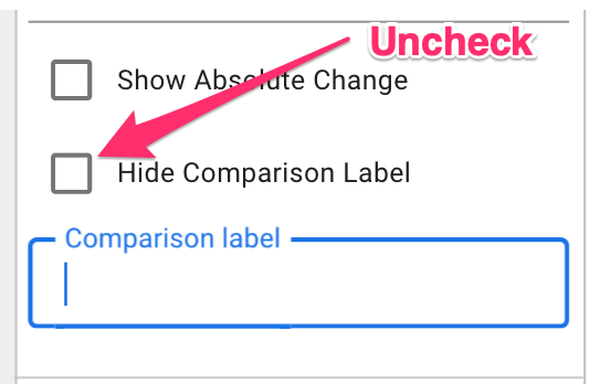
Here, you can also change whether the comparison is a percentage or absolute value and customize what the comparison label says.
Additionally, with the comparison label, the default is for any downward trends to be displayed in red and upward trends to be displayed in green. However, it’s not always the case that a downward trend is a negative thing (e.g. bounce rate), so you can change the color of the comparison.
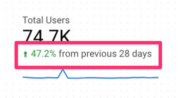
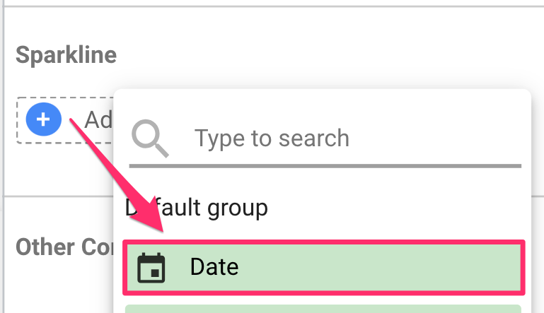
Back in the Setup tab (in Properties), add a sparkline using the “Date” dimension to show the daily trends of the metric over the time period.
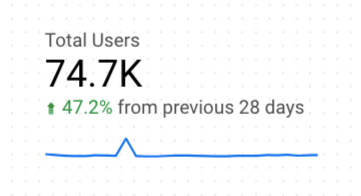
This is what your scorecard should look like!
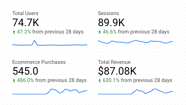
Now, there are three additional metrics for which we want to create a scorecard: Sessions, E-commerce purchases, and Total revenue. To simplify things, you just need to copy (ctrl-c) the scorecard we made, paste it (ctrl-v) three times and update the metric in the Properties tab.
Add a rectangle behind each scorecard.
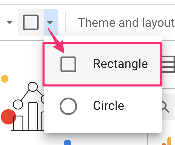
Right-click on the rectangle, go to “Order”, and select “Send to back”.
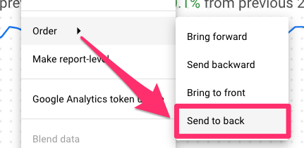
In the Rectangle Properties, you can customize the shape by changing the color or adding a border shadow. Copy this rectangle for each scorecard and align them across the top of the report.
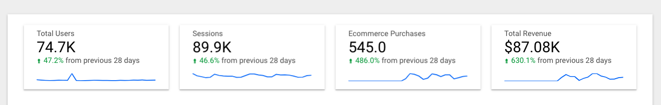
There you have it – the first part of your new dashboard! Let’s get into some more detailed charts now.
Add a table
Note: “Conversion Rate” is now labeled as “Key Event Rate” or “Session Key Event Rate”. They function similarly for reporting purposes.
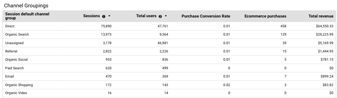
A table will provide more detailed data on metrics broken down by a dimension, e.g. users per day, views per page or sessions per channel grouping.
The table will focus on channel groupings, so in the Setup tab of Properties, update the table:
Add dimensions: Session default channel grouping
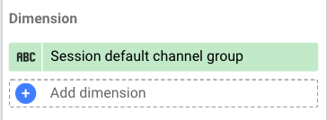
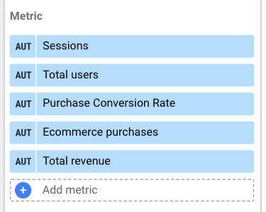
Add metrics: Sessions, Total users, Purchase conversion rate, Ecommerce purchases and Total revenue.
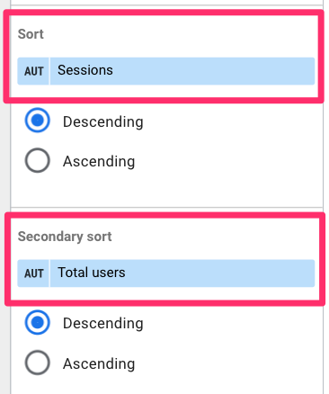
Change sort and add a secondary type. You can temporarily update the sorting of the chart by clicking the column header (in either view or edit mode), but this won’t actually change the sort permanently.
Now, we’re going to fix up the style of the table. Go to the Style tab of Properties. Here, we will do a few things:
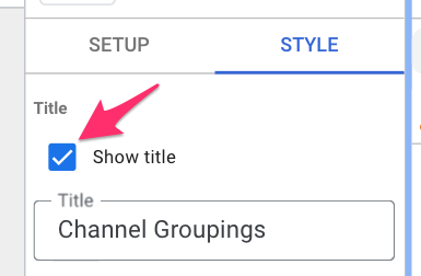
Add a chart title: Click the checkbox next to “Show title” and enter the chart title.
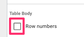
Uncheck row numbers (I find this just to be distracting)
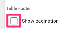
Hide pagination: If all table rows can be shown, you can hide the pagination at the bottom of the table to make it look cleaner.
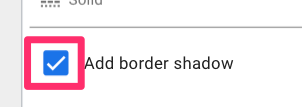
Add border shadow
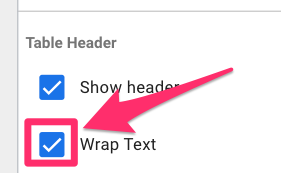
To finish the table, resize the chart’s columns so that the headers are visible.
You may not be able to see the entire header for each column, but in this case, you can enable the header to have wrapped text in the Style tab.
We have created all the data elements of this simple report with these two charts. However, it doesn’t look the most aesthetic, so let’s fix that!
Update report background
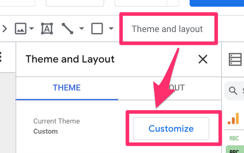
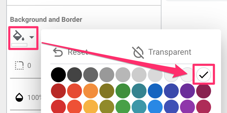
First, if you haven’t chosen your report background color (if you don’t want it to be white) in the Theme and layout section, head over there now. Select “Customize”.
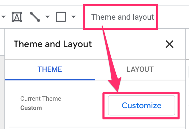
Click “Report background” and select the color you want. I chose a light grey to let the white scorecards stand out on top of it, but you can choose whatever color you like.
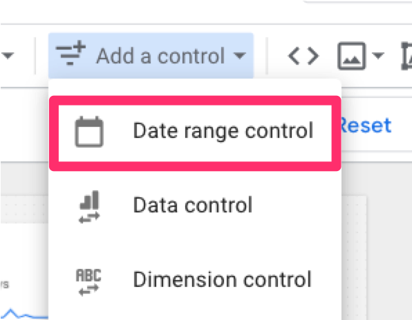
Add controls
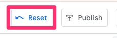
Controls are filters or buttons that you can add to your report. By adding filters to your report, you give yourself and your viewers more control to customize the data available in the report. You can remove any filters by clicking the “reset” button at the top of the page.
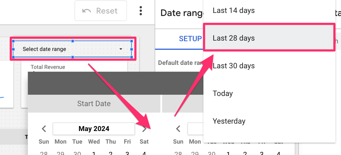
Date range
First, add a date range filter.
Click the date range filter to open the Date range control Properties and set the default date range, which the report will always revert to (click the “Reset” button if you want to revert it manually).
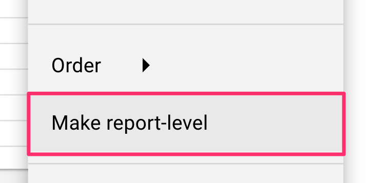
If you end up adding more pages to your report, you will probably want to have the date range control (and maybe some of the other filters) across all pages of the report. To do this, right-click on the control and select “Make report level”.
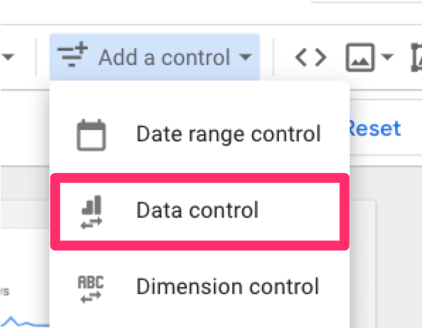
Data control
Second, add a data control. If you have multiple properties, you can add this filter to easily see this dashboard for each GA4 property rather than making a new dashboard for each property.
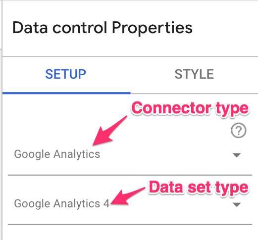
Select the “Connector type” and “Date set type”. In this case, it will be “Google Analytics” and “Google Analytics 4”, respectively.
Dimension filters
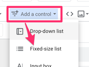
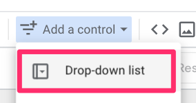
Third, add a drop-down list so that you can filter by any of the dimensions (e.g. device category, hostname).
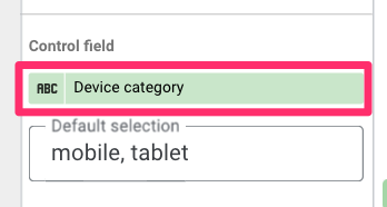
Choose the dimension to filter by in the Setup tab under the Control field. Optionally, you can set default values for the drop-down list. If you don’t put anything, all values will be shown by default.
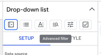
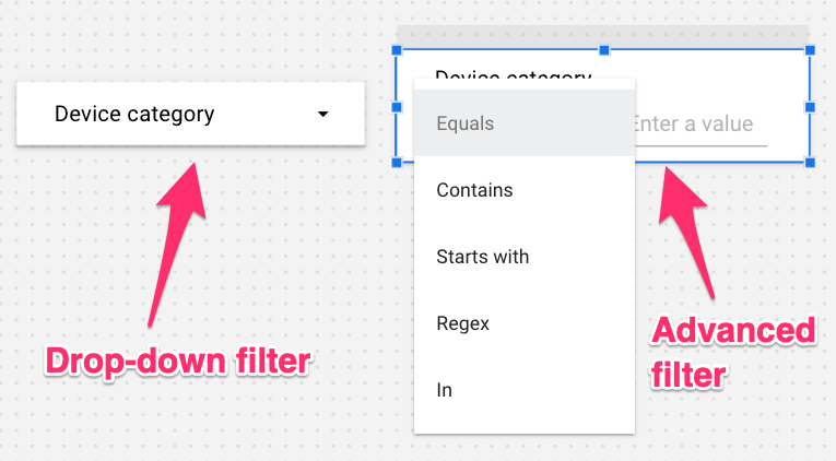
If you want more freedom with your filters, you can change the control type from “Drop-down list” to “Advanced filter” by clicking the arrow in the top-right corner of the Properties tab (next to the header “Control”.
This will give you more freedom in how you filter, but it also gives you a bulkier element.
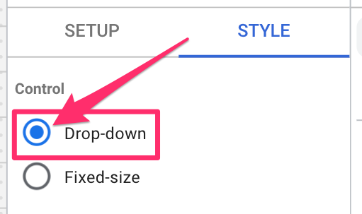
However, if you prefer a more streamlined appearance while maintaining advanced filtering capabilities. Simply select “Drop-down” instead of “Fixed size” under the Control settings.
Update style
To update the color of the filter elements, start by holding shift and selecting each filter you just created. Then, navigate to the Style tab under Properties. Here, you can update the color of the filter elements to be different from the report background. In this case, I’m changing it to white.
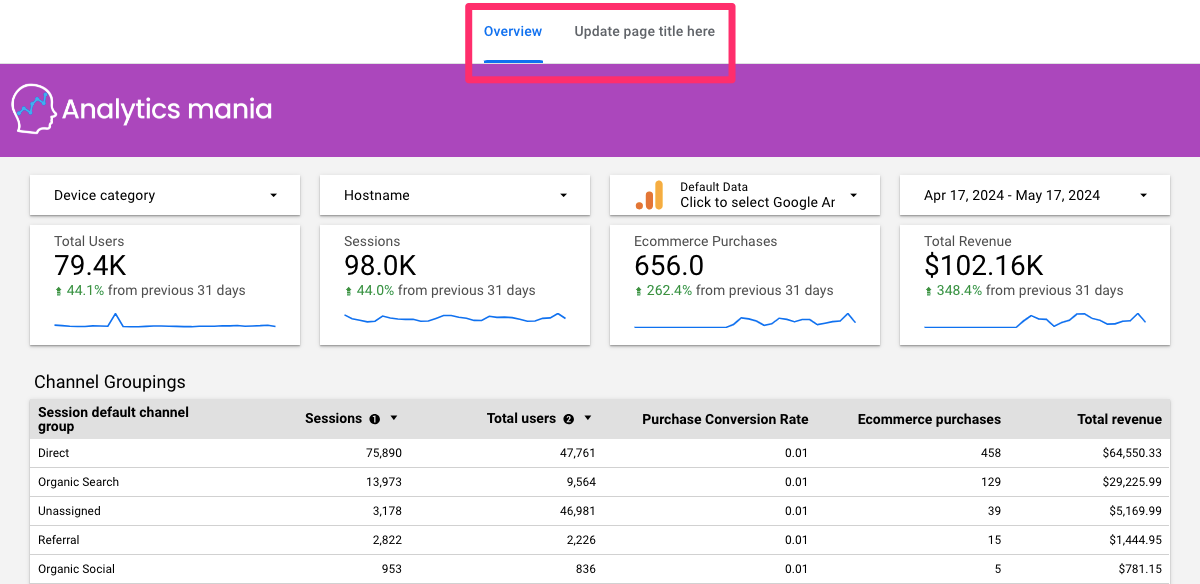
This is what your report should look like now!
Add an image (e.g. logo) & header
If you want to get fancy with it, you can customize your report to include your company’s logo or your client’s logo.
Move down all the elements in the report to make some more space at the top. Add in a rectangle, updating the color to be something fun.
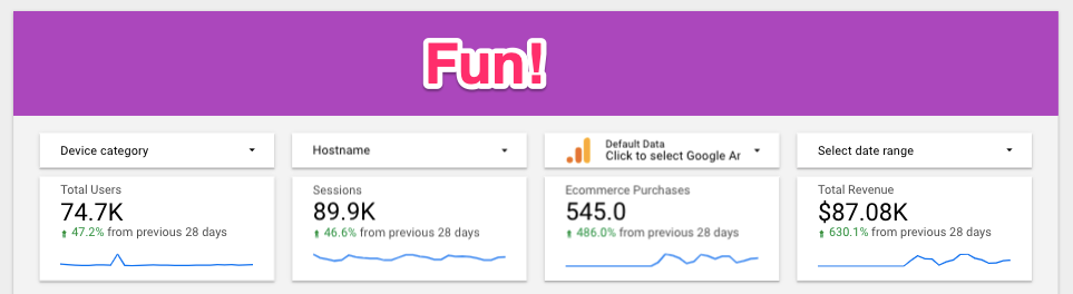
Click the images icon in the toolbar, and select an image of the company logo from either your computer or a URL.
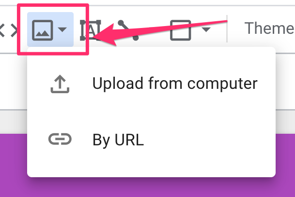
Position the logo, and you have yourself a customized dashboard!
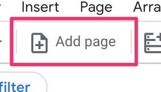
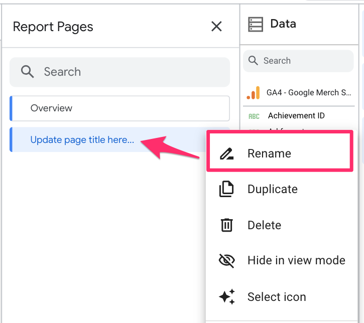
Add pages & rename pages
If you decide that you want to build off this report and add more pages, select “Add page” in the toolbar.
This will then change to say “Page X of Y”.
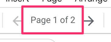
If you click on this, it will open the Report Pages tab. Here, you rename, duplicate or delete the page, hide it in view mode and select an icon to represent the page.
If you go back into the Theme and layout section, you can also change how the page navigation appears in your report. Go to the Layout tab, click “Navigation type”, and choose how you want your page navigation to look.
Limitations
It would be too good to be true if there weren’t at least a few limitations to Looker Studio. No tool is perfect, so let’s review some things you need to keep in mind while using it:
- A maximum of 100 pages is allowed in a single report.
- A maximum of 50 data components are allowed per page.
- The canvas size must be a minimum of 10px by 10px and a maximum of 2000px by 10,000px.
- Looker Studio reports using Google Analytics 4 data are limited to Analytics Data API (GA4) quotas. You may receive error messages if you exceed the quotas.
- New Google Analytics 4 dimensions and metrics sometimes become available in Looker Studio much later than in your GA4 property.
Hot tips
#1. Know your data and the GA4 data model very well before starting! It’s difficult enough to learn a new tool, but even more so if you don’t know what the data you’re working with looks like. Check out my Google Analytics 4 course to dive deeper into learning GA4.
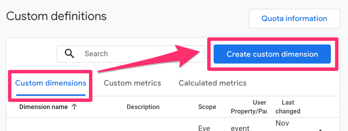
#2. If you want to see custom event parameters in Looker Studio, you must add those parameters as custom dimensions in the GA4 interface. To register parameters as custom dimensions, go to Admin > Data Display > Custom Dimensions. Click “Create Custom Dimension”.
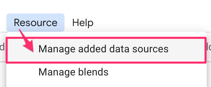
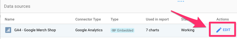
Custom dimensions will take up to 48 hours to appear, and you might need to reconnect the data source to see the new parameters. To reconnect the data source, go to Resource > Manage added data sources.
Click “Edit” on the data source to which you added the parameter.
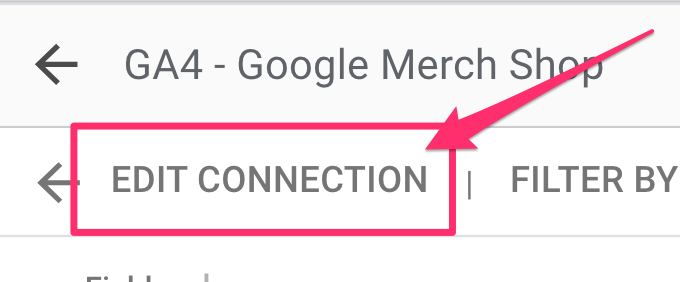
Select “Edit connection” on the top left.
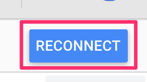
Now, click “Reconnect” on the right side of the new screen. A popup will show the changes to the data source, which will occur once you reconnect the data.
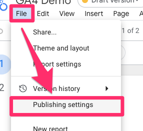
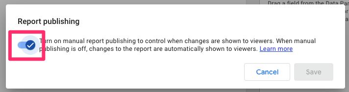
#3. Enable manual report publishing: By default, manual report publishing is disabled, which means that any changes to your report will automatically be published for everyone to see. Enabling manual publishing reduces the risk of viewers seeing something that is not ready to be seen. To enable it, go to File > Publishing settings.
When the popup appears, click the toggle on.
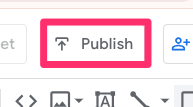
Now, when you’re in edit mode, you must click “Publish” in the top-right of the interface to push through any changes to the published view mode.
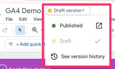
You can toggle between seeing the published version of your report and the draft version, which contains the unpublished changes you’ve made in edit mode, by clicking the dropdown next to the report title.
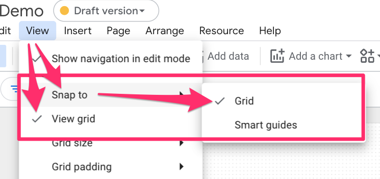
#4. Add a grid to guide you while creating your report. Go to View, enable “View grid”, and select “Snap to” > “Grid”.
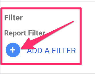
#5. You can set filters on a chart or report level, so if you just need one chart to be filtered, add the filter to that chart (I will show how to do this in the example later on). Otherwise, if you need the entire report to be filtered, add it as a report filter to save time. Go to File > Report settings.
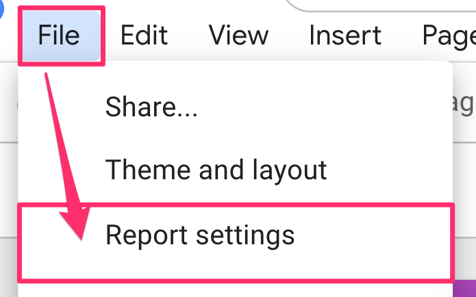
When the Report Settings tab opens, scroll to Report filter at the bottom and select “Add a filter”.
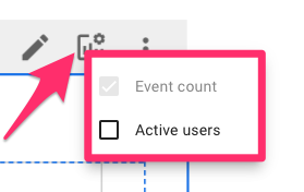
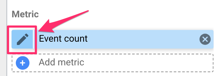
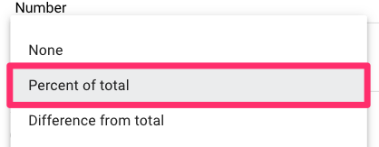
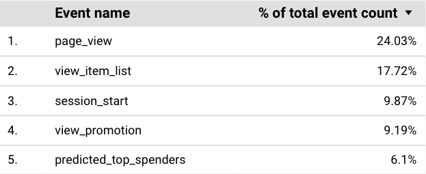
#6. Make a metric a percentage: Let’s say you have a table with the event count per event. Sure, the page_view event is the top event with 231K occurrences, but how does that actually compare to the other events? This is where it would be handy to see what percentage of events page_view makes up. To update this, select the table, and in the Setup tab of Properties, click the pencil icon next to the Event count metric.
Under Data Type, select “Numeric” > “Percentage”.
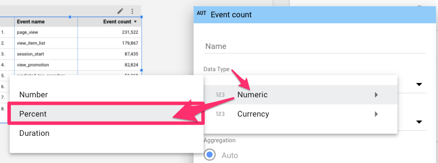
This will just turn the number into a percentage, which is not exactly what we want, so you will need to select “Comparison calculation” and choose “Percentage of total”.
Now, you can more easily compare the event counts of different events.
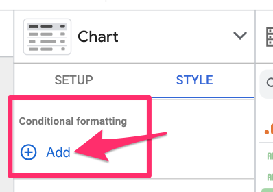
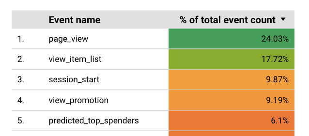
#7. You can use conditional formatting to change the colors in your chart dynamically. Let’s say you’re displaying a metric with a scale of 0 to 10; you can add a color scale to the chart using conditional formatting to visualize the status of that metric better. You can find the conditional formatting settings in the Style tab by clicking on the element to which you want to add the formatting.
Here, you can choose which column(s) of the chart you want to add the formatting to, whether you want single colors or a scale, and the scale’s scale’s intervals. The result could look something like this:
#8. Change chart type. Suppose you want the same metric and filters but a different chart type. Open the chart options in the Properties tab.
Select the chart type you want, and you’re good to go (additional information or formatting may be needed).
Looker vs. Looker Studio vs. Looker Studio Pro
If you search Looker in Google, you may find yourself confused with the multiple products all sharing the same “Looker” name: Looker, Looker Studio, and Looker Studio Pro.
Looker Studio and Looker Studio Pro are the same product, just different versions. In mid-2023, Google released Looker Studio Pro, a paid upgrade to Looker Studio. Depending on how you use Looker Studio, this upgrade may or may not be worth it. Some notable features included with the Pro version are:
- Multiple email schedule deliveries on one report: With the free version of Looker Studio, you can only have one email schedule per report. With the free version, you must create multiple copies of those reports if you want to send the same report but with different filters (e.g., sending reports to various clients).
- Personal report links: You can share a personal link to a report with another Looker Studio Pro user, allowing them to edit the report without changing the original copy.
- A minor feature, but something I like, is that you can create multiple workspaces and folders to organize your reports (and who has access to them).
Looker Studio (free and Pro) are not the same thing; they are entirely different products under Google’s analytics suite. Looker is a paid BI tool that requires more advanced implementation and configuration than Looker Studio’s more straightforward, out-of-the-box solution.
If you’re searching for things online about Looker Studio, double-check that it’s not talking about Looker (sans Studio).
Looker Studio Tutorial for Google Analytics 4: Final Words
You made it to the end! Hopefully, you found this to be an informative (dare I say, even fun) journey through Looker Studio. You can do far more beyond what we have covered here in Looker Studio, including many more chart types, blended data, custom queries, and so much more.
If you have any Looker Studio topics you want to learn more about, post them in the comments below! Perhaps there will be more Looker Studio content in the future.
Good luck and happy data visualization!
2 COMMENTS
Hello, I need the date comparison to be applied for the entire report, not for just one widget, how can I get that?
Thank you!
Hi Julius, first of all, thank you very much for all the content you offer, it is very helpful. I wanted to ask you something about Looker Studio. I followed your tutorial to track the CF7 form and everything fine. But when I create the Looker Studio report and put the CF7 form metrics, I get an error message “Dataset configuration error.
Looker Studio is unable to connect to your dataset.” I can't manage to fix it, how could I do it or what could be happening?