


September 21, 2026
Google Analytics dashboards. A step-by-step guide.
Sometimes, you just want to open Google Analytics 4 and check a few numbers. How many sessions did the website get? How many leads did it generate?
Standard reports and explorations can answer those questions, but switching between reports isn’t very convenient when you want the same overview every time.
In a nutshell, Google Analytics dashboards let you add scorecards, charts, and tables to one canvas in the Reports section. You choose the metrics, apply filters, and publish the dashboard to a collection so other users of the property can find it.
In this blog post, I’ll show you how to build a dashboard for leads, publish it, and avoid a situation that breaks the key event rate metric.
However, I will be honest upfront. This feature is probably aimed at complete beginners in analytics, or those who just need basic stats in a single canvas (without building external dashboards in Data Studio).
This feature does feel a bit underwhelming, with limited options. If your needs go even slightly beyond the beginner level, you should probably stick with Data Studio (at least).

Table of Contents
Here’s what you will learn in this article
- What are dashboards in Google Analytics 4?
- How to create a dashboard in GA4?
- Add scorecards for your main metrics
- Filter a scorecard to show only leads
- Add a line chart for leads over time
- Add a table with traffic sources and leads
- Save and publish the dashboard
- How to delete a dashboard in Google Analytics?
- When should you use GA4 dashboards?
- Final words
Video tutorial
If you prefer video content, watch this tutorial from my YouTube channel.
What are dashboards in Google Analytics 4?
GA4 dashboards are customizable reports where you arrange individual scorecards, charts, and tables. For example, you can put sessions and leads at the top, a lead trend underneath, and traffic sources at the bottom.
Here’s how I would describe it: a lite version of Data Studio, built right inside Google Analytics. If you only need a fairly basic overview, this is a useful addition. Otherwise, look elsewhere.
The dashboard editor has a canvas where you can drag and drop metrics + dimensions. Without further ado, let’s take a look at how it works.
How to create a dashboard in GA4?
Open your Google Analytics 4 property and go to Reports > Create > Dashboard. The same menu also contains Detailed report and Overview report, so choose Dashboard for this walkthrough.
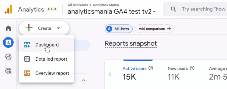
If you don’t see the “Create” button, you probably don’t have enough permissions in this Google Analytics property (Editor or Administrator is required).
For this example, I’m building a dashboard for leads. My test property already collects the generate_lead event, which I configured with Google Tag Manager, and the event is marked as a key event.
Keep in mind that adding a dashboard doesn’t set up tracking. Google Analytics doesn’t automatically collect generate_lead just because you use that name in a filter, so you’ll have to do it yourself. If you’re not sure where to start, take a look at this article where I track form submissions.
Anyway, after you initiate the creation of the dashboard, you’ll be greeted by a canvas on the left and a metric/dimension/settings sidebar on the right.
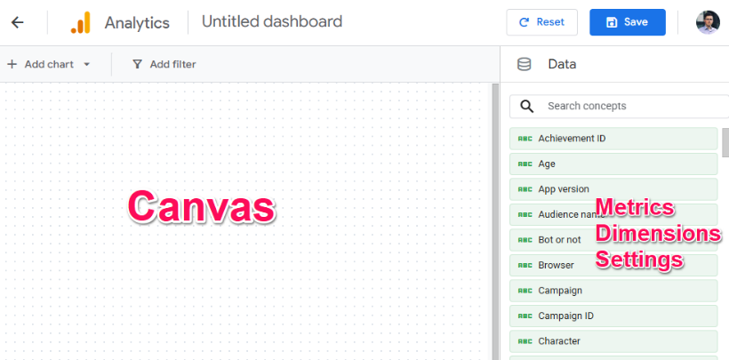
Metrics are blue, and dimensions are green. If you want to add anything to the canvas, you have several options:
- You can drag and drop the dimension/metric from the sidebar to the right side.
- You can double-click it
- Or you can click “Add chart” at the top left corner.
If you drag or double-click the dimension on the right side, it will automatically be displayed as a table. And if you add a metric, it becomes a scorecard on the canvas.

Add scorecards for your main metrics
Scorecards display individual metrics, such as sessions or total revenue. In the dashboard editor, find a metric in the right sidebar and drag it onto the canvas, or double-click it.
For the example dashboard, add these five metrics:
- Total users
- Sessions
- Total revenue
- Key events
- Session key event rate
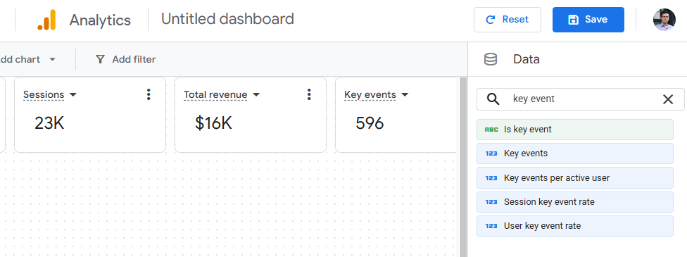
Move the scorecards toward the top-left corner of the canvas and resize them as needed. My suggestion is to avoid leaving a large empty border around the dashboard because the layout can already take more screen space than you’d expect.
At this point, Key events and Session key event rate include all events marked as key events in the property. If both purchase and generate_lead are key events in your property, those scorecards aren’t limited to leads yet.
So, how do we filter a scorecard (or any other element on a page) to just a particular event?
Filter a scorecard to show only leads
Google Analytics dashboards have filters at two levels: the entire dashboard and an individual chart. Use a chart-level filter when you want to change one scorecard without filtering the other numbers.
For example, I want the Leads scorecard to count only generate_lead events, but I still want the Sessions scorecard to show website sessions. Since different elements in the canvas will have different filters, we’ll need to use a chart-level filter.
Select the Key events scorecard, open its three-dot menu, and click Add filter. Configure the filter with these settings:
- Dimension: Event name
- Match type: exactly matches
- Value: generate_lead
Click Apply.
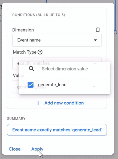
The scorecard title still says Key events (even though we applied a filter and narrowed down just to generate_lead). But that is not a problem because we can rename charts/scorecards/etc in the canvas. Click the scorecard’s three-dot menu, click Edit title, and rename it to Leads, then save the title.
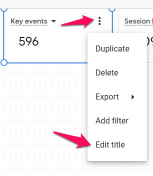
Why is this necessary? A scorecard title should tell the reader what the number represents. Someone opening the dashboard shouldn’t have to inspect a filter to discover that Key events means leads.
Why does session key event rate show 100%?
So, adding a filter to the “Leads” scorecard was easy. But if you tried to do the same thing to the Session key event rate, that would not work. The scorecard would show 100%.
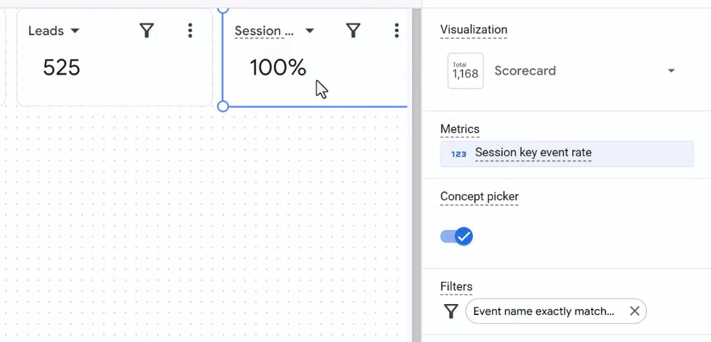
Why? Because of different scopes. Session key event rate is looking at sessions while the filter is looking at individual events. Let me explain.
Let’s say you have tracked 1000 sessions in total, and 50 of those generated leads.
To calculate a session key event rate, you would divide 50 by 1000 (50 / 1000 = 5%). But if you add a filter “Event name exactly matches generate_lead”, you are removing 950 non-converted sessions from the equation.
Instead, your scorecard looks only at 50 sessions that generated leads. It thinks that 50 sessions is the total. That’s why 50 divided by 50 equals 100%.
That’s what happened when I applied Event name exactly matches generate_lead to the Session key event rate scorecard in my test property.
To fix the scorecard in this setup, edit its Event name filter and select two events: generate_lead and session_start as values under exactly matches. These values work as OR: keep events named generate_lead or session_start.
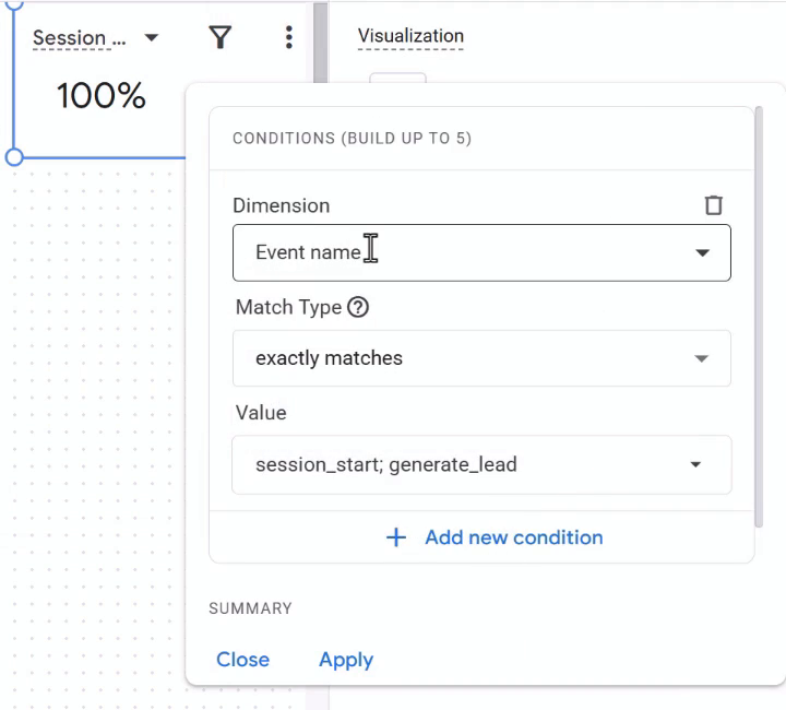
Why did we do that? Because we will want to include all sessions (even those that did not include a key event). A relevant event to achieve that could be session_start because, in proper setups, most sessions have a session_start event.
Click Apply, and the scorecard number should be fixed.
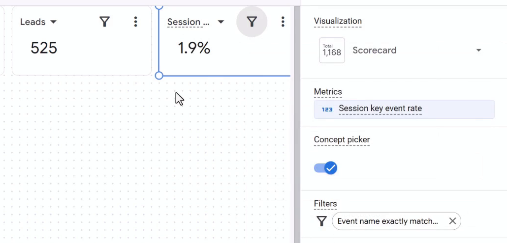
The generate_lead event represents the lead sessions, and session_start brings the other sessions into the calculation. This setup assumes generate_lead is marked as a key event and session_start isn’t.

Add a line chart for leads over time
Let’s add more variety to the dashboard. Click Add chart > Line chart, then move and resize the chart beneath your scorecards.
In the Chart Editor, use the following settings:
- Metric: Event count
- Dimension: Event name
- Chart filter: Event name exactly matches generate_lead
- Data granularity: Day
Click Apply. The line chart plots the selected event count over time, and the filter leaves only generate_lead events.
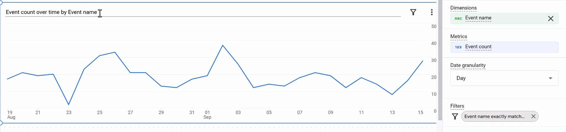
Open the chart’s three-dot menu, select Edit title, and rename it to Leads. That’s easier to read than Event count over time by Event name.
Notice that this chart uses Event count, while the Leads scorecard uses Key events. Event count counts occurrences of generate_lead, while Key events follows your key event configuration, so don’t assume the two metrics always mean the same thing. But in most cases, they should match.
Add a table with traffic sources and leads
Now, let’s take a look at a table as another available visualization option. Click Add chart > Table and resize the table to fit underneath the line chart.
This time, we’ll create a table comparing the sessions, leads, and lead rates associated with different sources and campaigns.
Add these dimensions in the Chart Editor:
- Session source / medium
- Session campaign
Then add these metrics:
- Sessions
- Total users
- Key events
- Session key event rate
You can reorder dimensions and metrics by dragging their handles in the sidebar.
Because this table includes Session key event rate, add a chart-level filter with Event name exactly matches generate_lead or session_start (same logic as it was with the Session key event rate scorecard). Select both event names in the same condition, then click Apply.
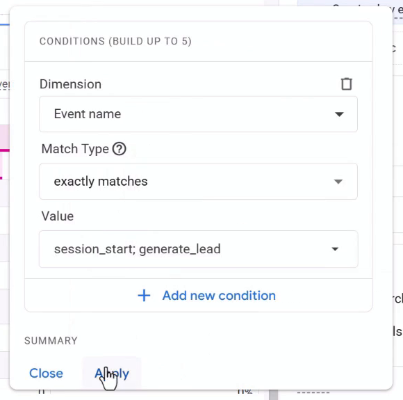
With this filter, the Key events column is limited to leads, assuming session_start isn’t marked as a key event. Including session_start also keeps sessions without a lead represented in the table.
The Chart Editor has options to show or hide the search bar and display a totals row. Enable Show totals row if you want a summary above the individual traffic-source rows.
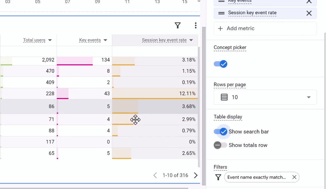
Finally, rename the table to Traffic sources (or something similar that makes sense to you).
Save and publish the dashboard
Now, you will need to do two things: save the dashboard and add it to the sidebar of the main Google Analytics navigation (left sidebar).
Saving the dashboard stores it in the library of all your available reports, and publishing it to a collection puts it in the Reports sidebar. That makes it easier for other users of the property to find.
Click Save in the top-right corner of the dashboard editor. Enter a name, such as Leads, and enable Publish to collection.
Select Custom dashboards, or create another collection if you want to organize your dashboards differently. Then click Save in the dialog.
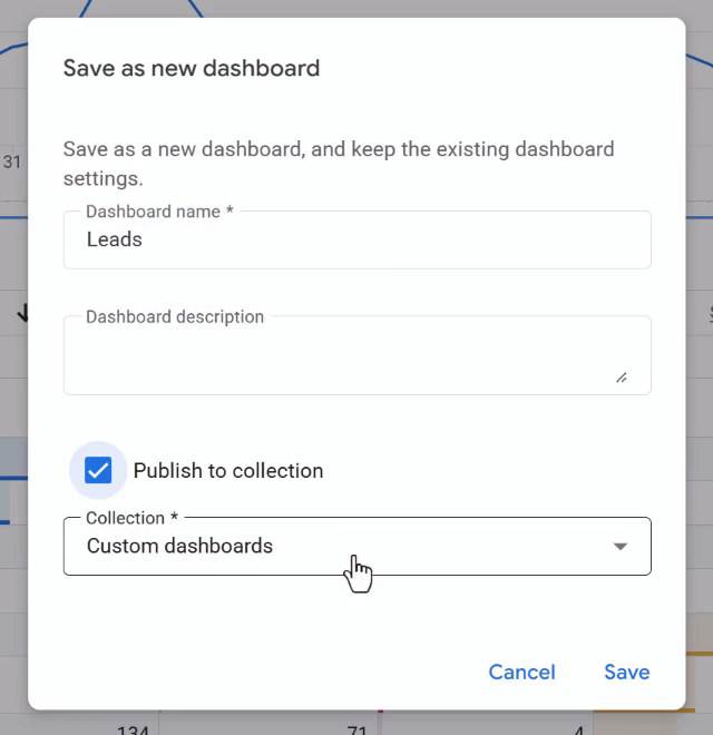
Open the collection in the Reports sidebar and select Leads to view the saved dashboard.
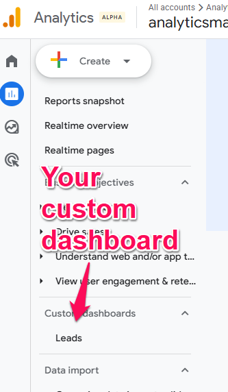
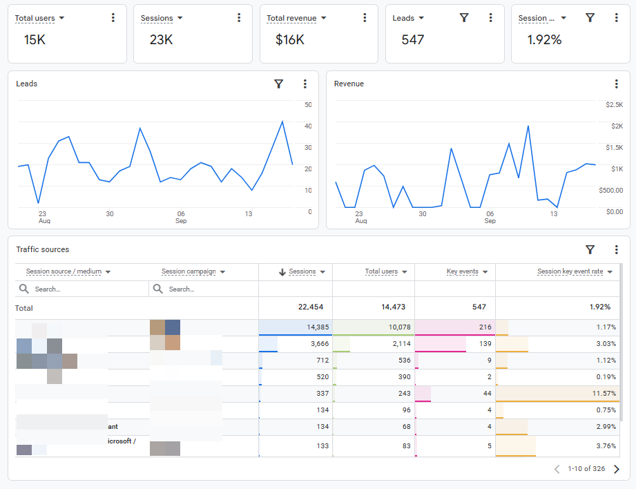
Click it and you’ll see your dashboard.
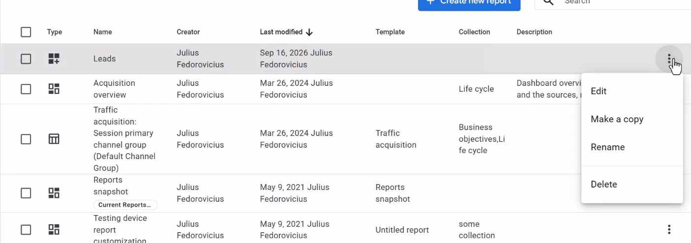
How to delete a dashboard in Google Analytics
If you ever decide to delete the dashboard, here’s how you can do that: go to Reports > Library (it should be in the bottom left corner) and find the dashboard in the reports list. Open its three-dot menu and select Delete.
When should you use GA4 dashboards?
GA4 dashboards are a decent fit when you want a simple overview next to your other Google Analytics reports. You could create separate dashboards for leads, purchases, organic traffic, paid social traffic, etc.
However, Data Studio remains much more powerful and customizable. I wouldn’t treat GA dashboards as a replacement for it, especially if you’re already happy with a more detailed reporting setup.
If you need that extra flexibility, take a look at my Data Studio tutorial for Google Analytics 4 (which was previously known as Looker Studio).
Dashboards in Google Analytics: Final words
Google Analytics Dashboards might give you a convenient way to check a few important numbers without leaving the GA4 Reports section. Add the scorecards you need, show the trend with a chart, and use a table when you want to compare traffic sources.
But if you need anything even slightly more complex, GA dashboards will fall short and you will need to use something else (for example, Data Studio connected to Google Analytics, or working with raw data in BigQuery).
When it comes to Google Analytics dashboards, pay attention to Session key event rate (or other metrics that calculate ratios).
In this blog post, filtering only to generate_lead produced 100% session key event rate, and including session_start in the same filter brought the other sessions back into the calculation.
Once the dashboard is saved, check the viewing interface too. The layout can need a few adjustments before it fits comfortably on screen.
If you want to get better at setting up Google Analytics and working with its reports, take a look at my Google Analytics 4 course.

0 COMMENTS