
March 28, 2025
How to build custom reports in Google Analytics 4
Updated: March 28th, 2025
In the older versions of Google Analytics, there was a section in Customization > Custom Reports where you could build custom reports. Things have changed in Google Analytics 4 with the introduction of Explorations.
In today’s blog post, I will explain how to build custom reports in Google Analytics 4 with Explorations by showing several examples (free form, funnel, and path explorations).
It feels that, in the end, even more people will start using Looker Studio for reporting, but in today’s article, I will focus on the built-in GA4 features.

Table of Contents
– Here’s what you will learn in this article –
- Main components of Explorations
- Free Form Explorations
- Funnel explorations in Google Analytics 4
- Path exploration in Google Analytics 4
- Navigating the Path Exploration report
- Other types of explorations
- Final words
Video tutorial
If you prefer video content, watch this tutorial from my Youtube channel.
Want to customize standard GA4 reports?
This article will focus on Explorations. But if you want to customize *standard* GA4 reports (located at the “Reports” section on the left sidebar), read this guide.
In a nutshell, you would be working with the Library and building reports such as “Pages on mobile” (showing what pages were visited with mobile devices).

Also, I talk much more about custom reports in my Google Analytics 4 course.
Main components of Explorations
To get started, click Explore on the left side of the Google Analytics 4 interface. I spend most of my time with Free Form Explorations. Therefore, let’s choose that one.
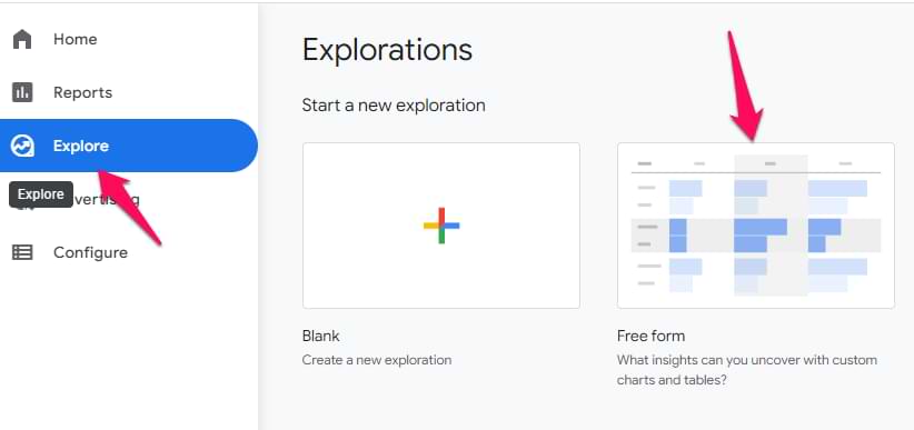
The interface in the Explorations is split into 3 main parts/columns:
- Variables (it’s responsible for segments, dimensions, and metrics that you can use in the custom report)
- Tab settings (it’s responsible for how data is used in the report)
- The output (the report that you generate based on your configuration)

Let’s take a closer look at each part.
Free Form Exploration
The best way to explain different components of the custom report in Google Analytics 4 is by showing how to build a free-form exploration.
Let’s start with the first column.
Variables
This has nothing to do with Google Tag Manager’s variables. The Variables section in the GA4 Free Form reports is the place where you select data that you plan to use in a report:
- Date range
- Segments
- Dimensions
- Metrics
Also, you can change the name of the exploration in the top-left corner of the interface.

To select a different date range, click the date in the top-left corner (below the exploration name) and select whatever you need (like “last 7 days”, “Last 30 days”, etc.).

Segments
If you want to compare how different groups of your users/visitors are behaving, you should include those segments in the Segments section first.
You can choose from several segments that are already included, or you can add your own. You can do that by clicking the plus icon:

Then you can either create a custom segment or select a suggested one.

If you want to learn more about segments, read this guide.
Dimensions and metrics
Dimensions in Google Analytics are parameters/attributes of an event, product, transaction, user, etc. Basically, they are attributes that describe something. For example:
- Event name
- Transaction ID
- User’s pricing plan
- Product category, etc.
Metrics help us measure. For example, how many events were made yesterday, how many transactions were completed last week, what was the key event rate last month, etc?
Speaking of the metrics that you can find in GA4, here are some examples:
- Event count
- Number of active users
- Number of transactions
- Engagement rate
Now that we have some basics, here’s the catch in the explorations. If you want to use a metric or a dimension in any exploration technique within that report, you must include the dimension/metric in the Variables column first. You can do that by clicking the Plus icon and then selecting what you need.
After you select the needed metric/dimension, click the Apply button in the top-right corner.

Also, some exploration techniques might not allow you to use certain parts of the Variables column. Example: Funnel report does not allow to include/use metrics.
To sum up, the Variables column is responsible for the data input. If you want to use some segments/metrics/dimensions, they must be included in that column. If you are missing something later down the line, you can add new items on-the-fly. Also, you can change the date range (which, obviously, also affects the scope of data input).
Tab settings
In this column of the custom report in Google Analytics 4, you can configure what the report will look like. First, there is a Technique drop-down menu (where you can select from things like Free Form, Funnel Exploration, etc.). In this blog post, I focus only on the Free Form part.
Then you will find the visualization section where you can select from:
- Table
- Donut chart
- Line chart
- Scatterplot
- Bar chart
- Geo map

Each visualization method affects which customization options will be available in that very same column. I usually find myself working with the Table, thus it will get most of my attention in this blog post.
Segment comparisons
In the Segment comparisons section, you can include up to 4 segments that are already included in the Segments section of the Variables tab.
You can add segments to the Tab Settings column by dragging them from the Variables tab. Also, you can just double-click in the Variables tab, and they will be added automatically.
If you have at least one segment added to the comparisons section, a new field will appear, Pivot. This field is responsible for the placement of segments in the table. It offers 4 options: first row, last row, first column, and last column.
If you want to learn more about this option, read this in-depth blog post about Free Form explorations.
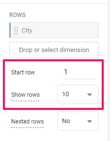
Rows
Here you can decide what dimensions you want to use in the rows of the table. In the screenshot below, you will see what the report looks like when the Browser dimension is inserted in the Rows section. Every row of that report contains a different browser name.

If you want, you can include multiple dimensions as rows. Then different combinations of all dimensions will be displayed as a separate row. Here’s an example of a report where I have device category and browser as two Row dimensions.

Also, you can select from which row to start and how many rows to display simultaneously.
If you work with multiple dimensions, consider switching to nested rows.
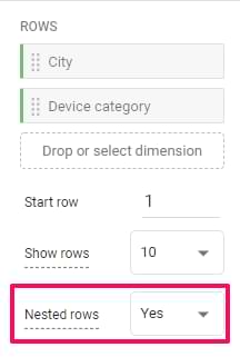
Remember my previous report example with two dimensions, browser and device category? Both dimensions were displayed in the same row. If you switch to nested rows, it will look like this:

Columns
Then, you can also add dimensions as columns. Let’s continue with the example of browsers and device categories. If I dragged the device category dimension from Rows to Columns, the report would look like this:
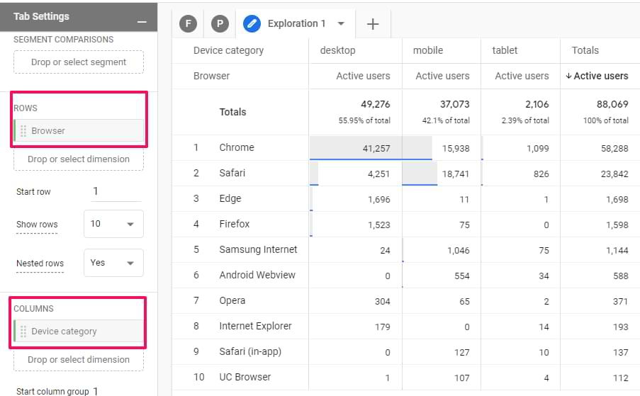
Now, every device category has its column.
Values
Here you can drag metrics that you want to display as columns in the report. The maximum number of metrics added to the Values section of a single report (a.k.a. Tab in the Explorations section) is 10.
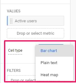
Also, you can select the cell type:
- Bar chart (this will show horizontal bar charts in every metric cell based on its value and the ratio to other rows in the same column)
- Plain text (this will display all cells without any additional visual enhancements)
- Heat map (this will color cells darker if their values are higher compared to other rows of the same dimension column)
Filters
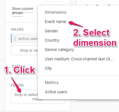
Here you can quickly narrow down the data you are using. For example, maybe you want to exclude a certain event from the report. Then you can click on the placeholder and select the dimension that you are going to use in the filter.
If you want to learn more about filters in explorations (custom reports), read this in-depth blog post about free-form explorations.
The Output (report)
Once you configure all the necessary things in the Variables and Tab Settings columns, the report should appear. Here you can do several things.
Add new tabs if needed. Every tab can use a different exploration technique (free form, funnel exploration, etc.). Also, duplicate and delete them by clicking the Triangle icon next to a tab name:

Start over, undo, redo, share the report, and download the report:

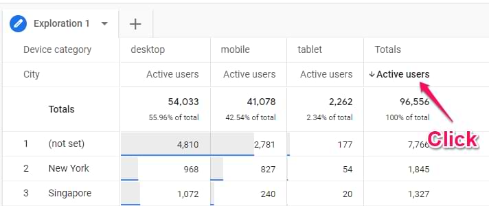
Click the metric label to change the sorting:
Do right-click on a cell to see additional options:
- Include selection
- Exclude selection
- Create a segment from the selection
- View users (in User Explorer report)

Include only selection will add an Include filter (or multiple filters if needed) to the report based on which cell did you click. For example, you can quickly narrow down your report to users, events, etc.
Exclude selection will add an Exclude filter (or multiple filters if needed) to the report based on which cell did you click.
If you accidentally included or excluded a selection, you can delete those newly added filters from the Filters section in the Tab Settings column. Or you can click the Undo icon in the top-left corner of the report.
If you click the Create segment option, you will see an interface of segment creation will some conditions that will be prefilled.
View users option will open a user explorer report with users that belong to that particular selection. In my screenshot, that option is disabled because I was working with the official GA4 demo account where this feature is not available.
If you want to learn more about Free Form Explorations and their examples, click here.
Also, if you build a report and see (not set) values, read this guide to troubleshoot.
Funnel explorations in Google Analytics 4
This is another popular exploration method in custom reports of Google Analytics 4.
When you work with different types of explorations, you will notice that the interface looks nearly identical (there are always 3 columns: Variables, Tab Settings, and the output of the report).
If you have different exploration techniques in the same exploration (e.g. one tab for Free Form, one for Funnels, etc.), the first column (Variables) will contain the same info. Tab settings, though, will be different.
Let’s take a closer look at the Tab Settings.
Visualization in Tab Settings
There are two options here:
- Standard Funnel
- Trended funnel
Standard Funnel is the one that you are probably most used to. It is a bar chart that shows how many people completed each step and what the drop-off is.

However, it is difficult to understand how the funnel is performing over time. That’s why the second option (Trended Funnel) becomes very handy.
Each funnel step gets its line in the line chart, and you can see how they changed over time. If you click on a certain line in the chart, it will stay highlighted. Also, if you want to see only one particular line, then there are tabs above the chart that you can click. There’s one tab for each funnel step.

Make open funnel
By default, Funnels in Google Analytics 4 are closed. This means that if a visitor enters the funnel at the 2nd (or further) step, he/she will not be counted in a funnel.
But if it’s ok for you if a visitor/user enters the funnel *at any step*, then you can click the Make open funnel toggle to allow that. I explain more about how this works in this chapter.

If you want to learn more about how an open funnel differs from a closed one, watch this video.
Segment comparisons
In the Segment comparisons section, you can include up to 4 segments that are already included in the Segments section of the Variables tab.
If you want to learn how to build a segment, read this blog post.
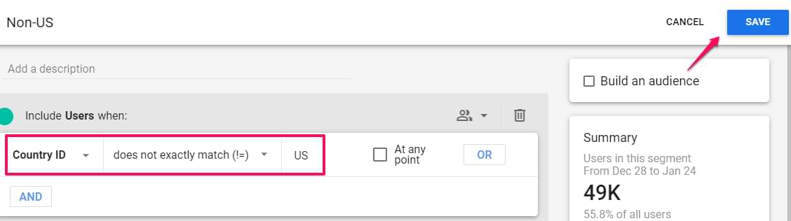
Let’s say that I want to compare US traffic to non-US traffic. The US segment is available by default in the exploration. All I need to do is to drag it from the Variables tab to the Tab Settings tab.
As for the non-US segment, here are its settings (learn how to configure segments here):
- Custom segment: User segment
- Country ID does not exactly match US
- Then name the segment. Click SAVE AND APPLY.
This new segment will be automatically added to the Segment comparisons section. We are now going a bit ahead of ourselves (because we haven’t configured our funnel yet), but here is what the segment comparison will look like.
Each segment will get its own bar (or line) in the funnel chart. Also, the breakdown table below the chart will show nested values.

Here, it’s more convenient to use the standard funnel report for segment comparison (because you can hover over a bar in the chart of a particular segment, and that entire segment will be highlighted).
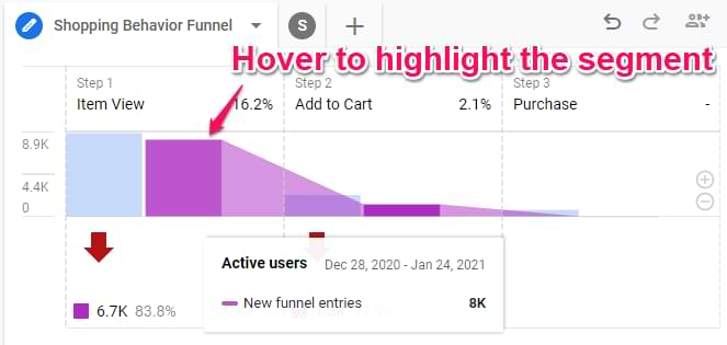
As for trended funnels, each step gets an individual line in the chart. Compare 2 segments, and the number of lines doubles. If you have 4 funnel steps and compare 3 segments, that will be 12 lines in a single chart, which can make things noisy and difficult to digest.
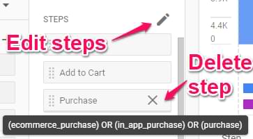
Steps
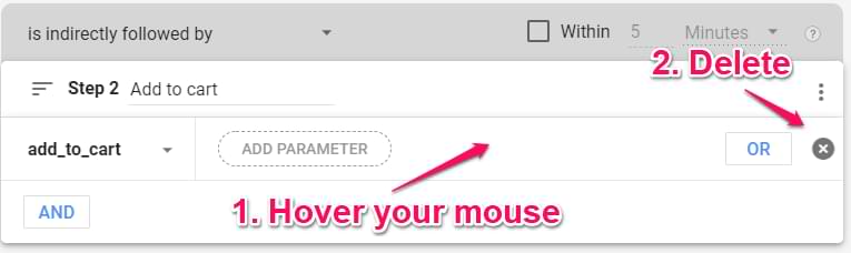
We have reached the main part of the funnel exploration report, funnel steps. If you already have some steps predefined there, you can delete them one by one by clicking the X next to each step. If you want to add/edit steps, click the Pencil icon.
This will open a funnel editing interface.
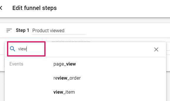
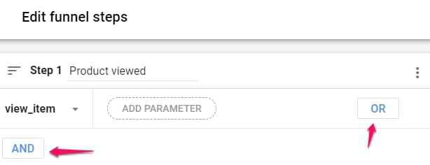
In each step, you can enter the label/name of it. It does not affect the data. Then, you can configure step conditions.
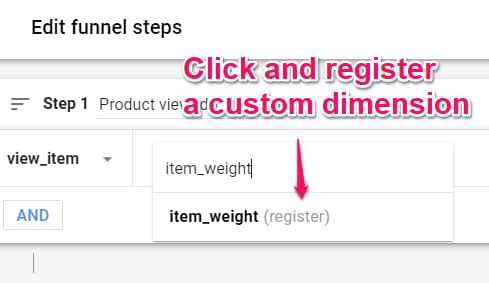
Click Add new condition and select from dimensions that are by default available or are registered as custom definitions in your property. It’s convenient to use the search feature.
Once you correctly enter the condition, you can include additional ones (connected with AND and OR) in the same step.
Also, if you try to use some parameter that is not registered as a custom dimension, you will see the (register) label next to it. Click that parameter, and you will be prompted to create it on the go.
If you want to delete a particular condition, hover your mouse on the right side of that condition to see the Delete icon.
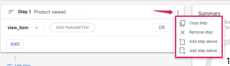
Each step also has several additional options in the top-right corner:
- Copy step
- Remove step
- Add step above
- Add step below
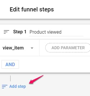
To add another funnel step, click Add step below.
Here you will see most of the settings that were also visible in the first step. However, some new things might tickle your curiosity.
- You can select whether you want this step to directly/indirectly follow the previous step. In most cases, I select indirectly.
- You can select the maximum time difference between both steps. It can be as short as several seconds but also can take days.
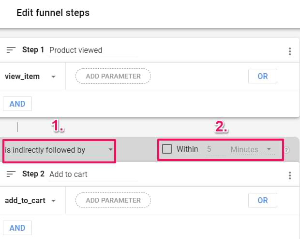
Once you have configured funnel steps, click Apply in the top-right corner.
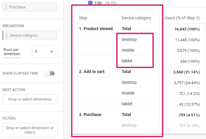
Breakdown
Below the funnel chart, you can see the data breakdown by a single dimension. For example, if you want to see how the funnel is completed with different devices, just add the Device Category.
If the dimension has more than several possible values, you can select how many rows per dimension you want to display (the default is 5).
There are more useful features in this exploration method (if you want to learn more, read this):
- Show elapsed time (shows how much time, on average, your visitors/users spend to move to the next funnel step)
- Next action (shows what are other top 5 actions/events that your visitors did after that particular funnel step)
The Output (report)
When the report is generated, you can interact with it and dig deeper.
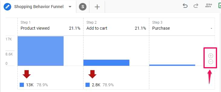
If the difference between some steps is too large (for example, step 1 contains 5000 users and step 2 contains 150), you can zoom in. Click the Plus icon in the corner of the bar chart. Also, you can hover your mouse over the chart and scroll up/down to adjust.
If you do right-click on any bar in the chart, you can create a segment from those users, or you can view them in the User Explorer report.
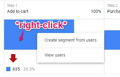
You can also do the right click on the abandonments in the chart (but only certain parts of that are clickable. The red arrow (as of the moment of writing this blog post) is not clickable. But if you click the number below it, you’ll see some options.
Another clickable thing is the cells in the table below the funnel chart. Here you can create segments and view users/abandonments.
Note: you cannot create segments via right-click if your funnel is set as an Open Funnel.
If you want to learn more about funnels and their examples, read this blog post.
Path exploration in Google Analytics 4
The last type of exploration that I want to explain in this blog post is Path exploration.
Simply put, it lets you see how your users/visitors use the website/app. You can learn what kind of events/pages occurred first, and if you click on a certain branch, you can then see what pages/events occurred after that.
This can help you understand the paths that your users/visitors take after completing certain actions.
Tab settings
In this column, you can configure what the report will look like. There is a Technique drop-down menu (where you can select from things like Free Form, Funnel Exploration, etc.). In this chapter, I focus only on the Path Exploration part.
Segment
Here you can add one segment to analyze only a certain subset of your data. The comparison here (like Exploration reports) is not available.
Node type
Unfortunately, you cannot change anything here. This part shows the types of nodes that you can use in the report.

What is a node? Every branch in the path exploration visualization is a node. Currently, the data can be split by Event name, Page title and screen name, or Page title and screen class. I wish there was one more dimension here, Page Path. Hopefully, this will be added at some point in the future.
View unique nodes only
Below the Node type, there is a View unique nodes only switch. It’s easiest to explain this feature with an example. Imagine that a visitor lands on your website, and you track the following events in this exact order:
- session_start
- page_view
- page_view
- view_promotion
If that toggle is disabled, it means that identical subsequent event names (or pages/app screen dimensions) will also be shown. Then the flow will look like this: session_start -> page_view -> page_view -> view_promotion.

If you enable the View unique nodes only, then several subsequent events will be ignored, and only the first one will be shown. Having the aforementioned 4 events in mind, the flow will look like this: session_start -> page_view -> view_promotion.

Breakdown
In this section, you can add a dimension that you want to use as an attribute to slice your data. For example, you can add the Device category dimension, and then you will see how your mobile users are behaving vs desktop.
At the bottom of the visualization, you will start seeing a legend. Click on the one that you are interested in, and it will be highlighted.

Values
Here you can add a metric that will be displayed (as numbers) in the path exploration visualization. At the moment of writing this blog post, 3 metrics are supported:
- Active users
- Event count
- Total users
Filters
You can add filters that will be used to narrow down a subset of the data that you are analyzing. However, I’ve noticed some quirky behavior here.
Here is a situation that I wanted to achieve.
I wanted to see only certain events in the path exploration, page_view, session_start, and purchase. Unfortunately, I was not able to make it work. Even if I added one filter Event exactly matches page_view, the output of the report was empty.
If you, like me, want to narrow down just to a certain list of events, create an Event segment instead (where you narrow down to just certain events). See the screenshot below.

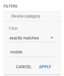
However, a filter where I narrowed it down to only mobile users worked well.
Node filters
If you want to exclude a certain node in your visualization, right-click on that node’s name and then Exclude node. Then you can select either to exclude it from all paths or just this one.
That filter will then be added to the Node filters section.

The Output (report)
Once you configure all the necessary things in the Variables and Tab Settings columns, the path exploration visualization will be generated.
It’s important to mention that clicking Start over (in the top right corner) will unlock a long-requested feature, reverse pathing. In GA3, it was only possible to create flow reports from the beginning (e.g. when someone lands on the homepage).
In GA4 path exploration, you can start from the end (e.g. when someone subscribes to your newsletter). Then you can see what events/pageviews occurred before a visitor subscribed. This can give you some hints and a better understanding of what happens.

Navigating the Path Exploration report
When the path exploration visualization is ready, click on a branch that you are interested in. Then you will see what visitors did next. Under the page title or event name, you will see a metric. This metric on what you have selected in the Values section of the Tab settings.

If you want to change the starting point (for example, you need a different event or page), you will have to click Start over. This will clear the visualization (but your Variables and Tab Settings will remain unchanged).
Speaking of all the other columns in the visualization, you can change their types. For example, instead of Event Name, you can select Page Title and Screen Name.

If you don’t want to see certain nodes in a particular column, you can click the pencil icon above it and then uncheck events/pages/screen names that you don’t want to see.

Then those values will be hidden in the bottom branch (a.k.a. More).

In Path Exploration, you can have up to 10 columns.
If you want to start from the end (a.k.a. reverse pathing), you will need to click Start over. Then click on the Ending point and select whether the initial column will be based on the event, page title, or some other dimension displayed there.

If you want to learn more about Path exploration and see some examples, read this article.
Other types of explorations
There are more exploration methods available:
But the aforementioned 3 are the most popular in my stack.
Custom reports in Google Analytics 4: Final words
There are many great features and new additions in the explorations. Finally, funnels are retroactive, path exploration can be made from the end of the funnel, and data can be combined in interesting ways in freeform explorations.
To learn more about these main three explorations types (and how you can use them to build custom reports in Google Analytics 4), please read these articles:
However, if I build a custom report and I want someone else to help me with it (read: collaborate), I cannot properly do that because at the moment of writing this blog post, explorations can be shared only in read-only mode. This means that if someone wants to edit it, they will have to make a copy of it. As a result, all subsequent changes that my coworker makes will not be reflected in my own exploration.
4 COMMENTS
Thank you Julius. Really clear explanation.
Question: I was able to select the date range and get the cumulative reports (by a date range). Can you please show me how I could be get the report by date, i.e., one row for each day.
Great post Julius.
How do you manage multiple Analytics accounts? Do you create new custom reports for every single account? Is there a way to copy/paste or export/import a custom report from account/client A to account/client B and C, etc.? Feels like a pain to do this for 10+ / 20+ accounts... What's your workflow with this? Any tips?
Thanks in advance for your answer!
Hi Julian - I have the same issues as Berrie. Lots of new GA4 reports to update in the library across 50+ acounts. Is there anyway to do this other thanrecreating each report individually.
Nope. Manual work it is.