
November 28, 2025
Google Analytics 4 Explorations: a Complete Guide
Updated: November 28th, 2025
Google Analytics 4 may not hold its strength in the built-in standard reports that it provides, but it does make up for it with its Explorations feature.
Google Analytics 4 explorations allow you to dive deeper into your data to get insights through customizable and interactive reports tailored to your business needs. For example, you can see how users navigate through your site, how new features are adopted, the effectiveness of marketing campaigns, and more!
With GA4 Explorations, you can visualize data, apply filters, compare segments, follow user journeys, and uncover meaningful patterns and trends to inform data-driven decision-making with seven exploration techniques that can be shared with collaborators.
This article will take you on a journey through all things GA4 Explorations, going beyond the constraints of pre-defined report templates. So buckle in.
Table of Contents
Here’s what you will learn in this article
- Benefits of GA4 Explorations
- Navigating to GA4 Explorations
- Types of Exploration Techniques
- Features
- Overview of the interface
- Limits
- Hot tips
- Free-form Exploration
- Funnel exploration
- Path exploration
- Segment overlap
- Cohort exploration
- User lifetime
- User explorer
- Final Words
Benefits of Google Analytics 4 Explorations
If you’ve been using the GA4 standard reports, you may wonder, “Why bother with Explorations? It seems like a lot of work.”
While a learning curve can be quite steep (as with all new tools), you will only reach the peak benefits of Google Analytics 4 if you explore your data beyond the basic information provided in the standard reports. I urge you to read this article and give explorations a try before rejecting the idea.
Let’s go through some benefits to help build that motivation!
- Customizable data for all: You may know that you can customize standard reports in GA4, but this feature only applies to those with Editor or Administrator roles. For most businesses, it’s likely only a handful of people will have these roles, and most people will have the Analyst role at most. This means that most people won’t have the ability to customize reports. However, everyone with permission to access the property can make explorations.
- Increased efficiency: For those with the Viewer or Analyst role, filtering or adding secondary dimensions to standard reports is inefficient (since these roles can’t customize reports). Explorations provide the ability to build reports based on business needs, which can be saved and easily referenced by the individual or shared with all in the property.
- Data consistency: Rather than having everyone create their own varying customizations to standard reports, you can create your own version of standard reports based on your business needs using Explorations that everyone in the property can reference. This will ensure that everyone uses the same data when making business decisions.
- Multiple ways to view data: While the standard reports offer basic visualizations (mainly tabular and time series charts), GA4 Explorations offer seven different techniques (we’ll get more into these next) and multiple visualizations for some techniques (e.g. table and time series, but also others, like scatterplot). By exploring data in different ways, you can uncover insights beyond just views and event counts of different pages or actions.

Navigating to GA4 Explorations
To find the GA4 Explorations, go to the left-hand navigation and click “Explore”.

This will take you to the Explorations landing page, where you can create a new exploration by selecting a blank report or technique, or view the explorations you and others in the property have created and shared.
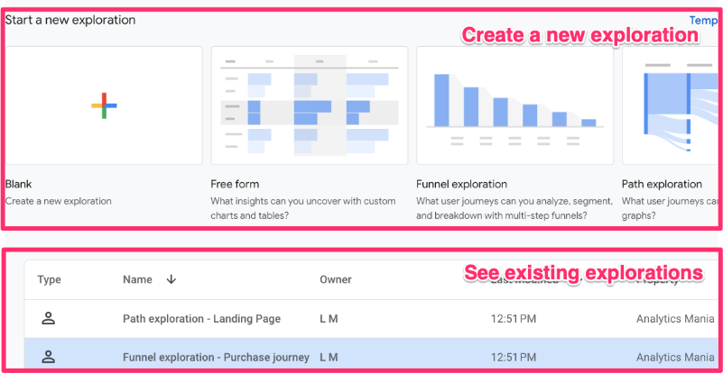
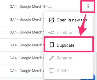
On the right end of each row is a list of actions you can select.
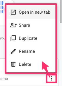
Notably, the “Share” option allows you to share any explorations that you own with everyone else in the same property, and “Duplicate” allows you to make a copy of your own report and any reports that others have shared (since these are shared as read-only, you need to make a copy to make any modifications).
Types of Exploration Techniques
- Free-form: As the name suggests, this technique offers a lot of variety of visualization to explore your data. Analyze and compare metrics and dimensions through different visualizations, like tables and time series charts, and use segments or filters to refine your analysis further.
- Funnel exploration: Examine users’ steps through a predefined conversion funnel, pinpointing areas where users drop off and identifying improvement opportunities.
- Path exploration: Without any set path in mind, uncover how users wander around your site, whether moving forward from a starting point or retracing steps backward from an ending point.
- Segment overlap: Compare multiple user segments to identify commonalities and differences in behaviour, helping refine targeting strategies and personalize user experiences.
- User explorer: Dive deeper into individual user behaviour, tracking engagement across multiple sessions to understand a user’s journey and preferences.
- Cohort exploration: Group users based on shared attributes and analyze how these groups (cohorts) change over time, providing insights into what could affect user retention.
- User lifetime: Explore user behaviour and value over their lifetime as visitors, guiding retention strategies.
Use this quick guide to decide which technique is right for your setup:
|
Exploration technique |
Best used for… |
Example question |
| Free-form | Custom tables and charts (mostly, tables). The most flexible option. | “Which city drives the most high-value transactions?” |
| Funnel exploration | Visualizing steps in a specific process. | “Where do users drop off during checkout?” |
| Path exploration | Discovering the next or previous actions users took. | “What page do users visit after reading my blog?” |
| Segment overlap | Comparing different audiences. | “How many mobile users are also purchasers?” |
| User explorer | Drilling down into individual user actions. | “What specific actions did User 12345 take?” |
| Cohort exploration | Analyzing user retention over time. | “Do users acquired last month return more often?” |
| User lifetime | Analyzing LTV and long-term behavior. | “Which source drives users with the highest lifetime revenue?” |

Features of GA4 Explorations
Let’s dive into the main features.
Overview of the interface
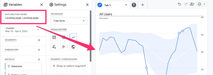
An exploration has four main sections (the image shows the interface for a Free form exploration):
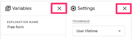
- Variables: The selected elements in this section stay consistent across all tabs of the exploration.
- Settings: These are tab- and technique-specific elements.
- Output and tabs: This is where the data will populate, and you can add additional tabs to the report.
- Toolbar: Additional components related to data and sharing.

Note: GA4 Explorations will automatically save, so if you exit the page accidentally or your browser shuts down on you, no worries, all your work will still be there.
Variables
- Exploration name: Even if you are the only one with access to the property, it’s frustrating to know that you have created a report but need to look through all explorations to find it because you didn’t name it well (or at all). So, use good naming conventions when naming your explorations.
- Date: Select any date range up to the start of tracking. If you notice that you can only go back two months, even though you know you have more data than that, the property’s data retention has likely not been updated. Read more about how to fix this issue here (note that this will only fix the issue going forward, not retroactively).
- Additionally, you can add a comparison date, which will show all values in your report for the original date range you have selected and another date range. You could compare the values of the previous year or of the previous time period.
- Segments, Dimensions & Metrics: You can import up to 20 dimensions, 20 metrics, and 10 segments into an exploration. Double-click, drag, or click on the landing spot (Segment comparison, Rows, Columns, or Values) to add a variable to the report.
- Segments are used to slice and dice data by grouping subsets of users based on given criteria, like demographics or acquisition sources.
- Dimensions are attributes of your data, typically in text, boolean (true or false) or date format, which can provide context to metrics.
- Metrics are numeric values representing a measurable quantity, including calculated metrics (creating new metrics out of existing ones).
Settings
The options in this section vary by technique. Technique-specific options will be mentioned in their specific section below, but these are the most common ones (taken from free-form exploration).
- Technique: You can choose the technique from within a report, and you can have multiple techniques in a single report by adding more tabs.
- Visualization: Not all techniques have this option. You can change the visualization when using the Free form and Funnel techniques. For the Free form technique, you have: table, donut, line chart, scatterplot, bar chart, and geo map visualizations. For the Funnel technique, you can use a standard or trended funnel.
- Segment comparisons: Add segments to the report to compare different subsets of users by double-clicking the segment, dragging it or selecting it by clicking on this element.
- Rows, Columns, and Values: Dimensions can go into rows or columns, and metrics can go into values by double-clicking, dragging, or selecting the dimensions or metric from the list by clicking on one of these elements. The report needs at least one metric in the values to populate any data.
- The report will show ten rows and five columns by default, but you can adjust it to 500 rows and 20 columns.
- Cell type: Changes how you can present metrics in a tabular visualization.
- Filters: Allows you to restrict the data in the report by creating conditions based on both dimensions and metrics. Be sure to click “Apply” once you have inputted the filter conditions. You can apply up to 10 filters per tab.
The output & tabs
This is where the data will populate after applying at least one metric. The data will automatically update with changes to elements in the “Settings” section.
You can add a new tab by clicking the “+” at the top of the interface. To keep things organized, be sure to name the tabs.
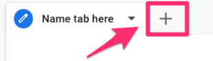
You can have up to 10 tabs per exploration with any combination of techniques. The “Variables” section will stay consistent throughout the exploration, but the “Settings” section will be tab-specific.
Toolbar
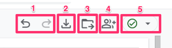
- Undo and redo any actions.
- Export data into Google Sheets, TSV, CSV, and PDF (current or all tabs).
- [This only applies to the funnel exploration technique] Save as a report in the library so you can add your funnel exploration to the standard reports by editing a collection. Go to Reports > Library > Select a collection and click “Edit” from the menu actions. Find the funnel exploration, drag it over, and “save to current collection”.


- Share the report with others in the same GA4 property. The report will be read-only, so no one else can modify the report. However, those with the Analyst and above roles can make a copy of the report and then make changes to their own version.
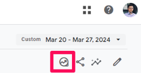
- The data quality icon will provide you with more information about the data being used in the report, like sampling and thresholding.
- A green circle with a checkmark indicates that your report is not sampled.
- A yellow triangle will tell you that you have data thresholding, sampling, or another similar issue.
- A red circle with an “!” means your data is heavily sampled. Here, you can make two (or three, if you’re in a 360 property) selections:
- “Load report faster”, which will maintain the sampled data.
- “More detailed results” will take more time, but reduce the amount of sampling or eliminate it completely.
- “Request unsampled report” allows 360 property users to request a read-only unsampled report. This report will load the unsampled data of the current tab in a new tab after a few minutes (so if you have 10 tabs, this won’t work). The unsampled reports are static (won’t change over time) and automatically deleted after 50 days. By requesting an unsampled report, your explorations will be automatically shared with the property.

Limits of Google Analytics 4 explorations
It’s always best to enter a situation understanding any limits or limitations so that you can best prepare, especially if you’re just starting out; it’s easier to plan ahead than make adjustments later.
- You can create up to 200 individual explorations per user per property and up to 500 shared explorations per property.
- There can be 20 dimensions, 20 metrics, and 10 segments per exploration, and 10 filters per tab.
- You cannot resize the columns of a report.
- For unsampled reports, each 360 property has a quota of 300 tokens per property per day for all users, which can query up to 15 million total events across explorations. These daily limits reset at midnight Pacific time. Unsampled reports are not available for the User lifetime technique.
- Shared Explorations are only available in read-only mode, so if you want to modify a shared report, you need to “Duplicate” the report.
- Limitations of specific techniques:
- The default metric of the funnel exploration is users, and it cannot be changed.
- The Cohort exploration will ignore User ID and only look at device data (e.g. cookies).
- When looking at an individual user in the user explorer report, there is a lack of descriptive information, e.g. you are unable to see on which page a specific event occurred.
| Feature |
Limit |
| Explorations per User | 200 (Private) |
| Shared Explorations per Property | 500 |
| Variables per Report | 20 Dimensions, 20 Metrics, 10 Segments |
| Filters per Tab | 10 |
| Data Retention (Free GA4) | Up to 14 months (must be configured) |
| Data Sampling | Occurs on high-volume data (10M+ events) |
Hot tips
- If you’re just getting into GA4 Explorations for the first time, or you have been doing it for a while, you may not always remember what every single component of the report means. Luckily, Google has made things easy for us and explained many of the report’s elements, as well as most built-in dimensions and metrics.
- To see an explanation, just hover your mouse over anything with a dotted underline. This is great if you need a quick reminder; otherwise, you can always refer to this article for more in-depth explanations.

- You can close the Variables and Settings tab to create a larger area for your visualizations to populate. This makes it easier to see more data at a time since you cannot adjust the sizes of the columns and rows.
Free-form Exploration
If I had to guess, free-form explorations are probably the most used technique. They can be used to create versatile tabular data visualizations (along with donut charts, line charts, scatterplots, bar charts, and geo maps) tailored to specific business needs. I usually go here first when trying to answer a question about user behavior.
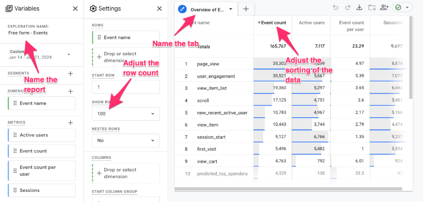
Example 1: Rebuild the Events standard report
Free-form exploration is the technique to use if you want to recreate any of the standard reports but customize the dimensions, metrics, filters, or segments.
The Event standard report is found in the built-in Lifecycle collection, which you can add to your property by going to Reports > Library and selecting “Publish” from the menu items.

To access the report, go to Reports > Engagement > Events. Here, you can see the dimension is the event name, and various metrics are included. What if you want to add a new metric, like sessions, or remove a metric, like transactions, or add a permanent secondary dimension, like an event parameter?
Unless you are the property’s Editor or Administrator, you can’t do this. But fear not—this is where GA4 explorations shine! Let’s recreate this report to suit our exact needs!
Method 1: From scratch
From the Explorations landing page, choose “Blank” or “Free-form”. When you click on a specific technique from this page, the report will be prepopulated with dimensions, metrics, and/or segments.

Since you can change the technique from within the report, I prefer to always start with a blank report so that I don’t need to remove the prepopulated elements.
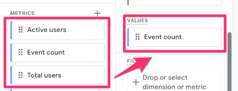
For the recreation of the Events report, I will include:
- Dimensions: Event name
- Metrics: Event count, Active users, Event count per user and Sessions
Double-click on each dimension and metric to add them to the report. Once the first metric has been added, the data will begin to populate. To change how the data is sorted, click on the heading of the metric or dimension you wish to sort by. Don’t forget to also adjust the number of rows to show more data.
The report will automatically save, so there is nothing else you need to do unless you want to share it with others. Then click on the sharing icon in the top right corner to share a read-only version of the report with others.
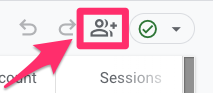
As a reminder, the report is shared as read-only, so no one else can modify your original report. However, those with the Analyst and above roles can “Duplicate” the report from the list of Explorations and then make changes to their own version.
Method 2: Shortcut from standard report
If that seemed like a few too many steps for you, there is actually a quicker way to do this! All you need to do is open up the standard report that you want to recreate and find the “Export this report to analysis” icon below the date picker.
This will open up the report as an exploration, so you can make any adjustments that you need for it to better suit your business needs, including adding segments, filters, and additional dimensions and metrics.
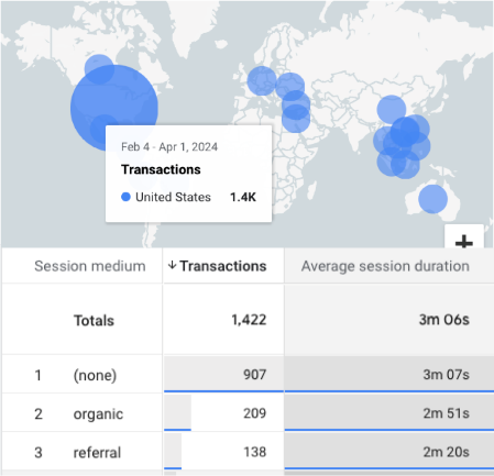
Example 2: Which marketing channels drive the highest-quality traffic to your site?
Understanding which marketing channels drive the highest-quality traffic helps optimize budget allocation and refine targeting strategies. Ultimately, if you want to ensure that you are maximizing the returns on your investments, you need to keep track of how different marketing methods compare to each other.
To a blank report, add:
- Dimension: Session medium (you can expand this to include Session source and Session campaign too)
- Metrics: Transactions, Average session duration

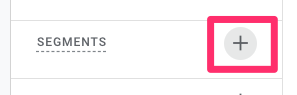
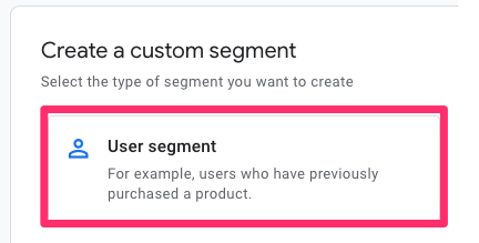
To explore the data further, you can create two segments that compare the actions between mobile and desktop users. Click the “+” next to Segments to create the two segments.
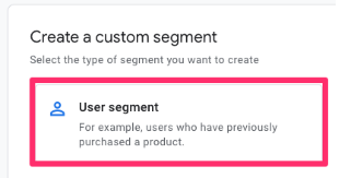
Click “User segment”.
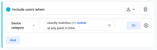
For the mobile traffic segment, add “Device category exactly matches mobile”, name the segment “Mobile traffic”, and click “Save and apply” (which will apply the segment to the report).
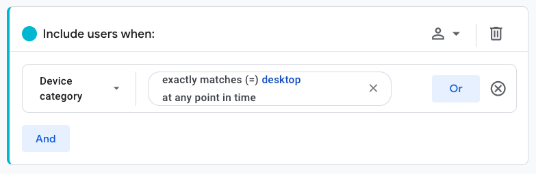
For the desktop traffic segment, add “Device category exactly matches desktop”, name the segment “Desktop traffic”, and click “Save and apply”.
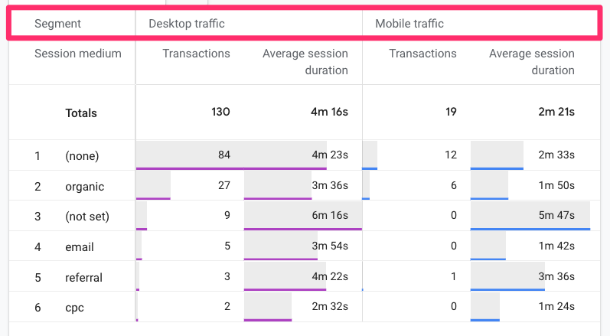
Now, you can start to look for insights in the data, like why emails lead to higher-quality traffic when users are on their desktops compared to mobile.
Example 3: What keywords are most often searched for by users on your site?
Search terms are an interesting dimension to examine because they tell you precisely what a user is looking for on your site. This information can help you determine where to prioritize time and effort. Check out this article on how to track site search with GA4 (if you haven’t already)!
For this report, add:
- Dimensions: Search term and Event name
- Metrics: Event count
- Filter: Event name exactly matches view_search_result
Funnel exploration
Funnel explorations enable you to analyze the completion and abandonment rates along a pre-defined user journey, which can help you identify bottlenecks in specific paths on your site. Identifying obstacles along these paths can help improve the user experience by pinpointing areas where users encounter difficulties.
Under the Settings tab, some components are unique to funnel explorations:
- Open vs. closed funnel: In a closed funnel, visitors must have started from the first step, but in an open funnel, users can be included in the funnel at any step (even if they didn’t complete the one before).
- For example, if your funnel includes steps A, B, and C, a user could have completed only steps B and C and still be included in the funnel, whereas in a closed funnel, the user needs to start at step A.
- Use a closed funnel when you want to analyze a strict, required sequence (e.g., a multi-step checkout form where Step 1 must happen before Step 2).
- Use an open funnel for looser user journeys (e.g., users might enter your site directly at the ‘Product Page’ step via an ad, skipping the ‘Homepage’ step). This gives you a more realistic view of non-linear behavior.
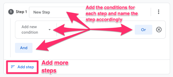
- Steps: This is where you specify the steps of the funnel. A single funnel can have up to 10 steps, which can be a combination or multiple dimensions.
- For example, step 1 could require the user to view a specific page, and step 2 could require the user to complete a particular event, and so on.
- Breakdown: Include any additional dimension to break down the visualization, such as device category or city. You can see up to 15 rows of dimension values per step. Users will only be attributed to the first instance of the breakdown value that applies to them, e.g., if the user starts the funnel on mobile but completes the last step on a tablet, they will only be counted under mobile throughout the funnel steps.
- Show elapsed time: By turning this on, you can see the average time between each step.
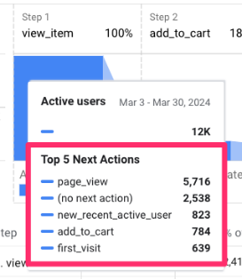
- Next action: When you hover over the bars in the visualization, it will show the top five actions users took after each step, so you can see where users are going beyond the pre-defined step.
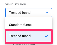
For the visualization, you can choose between a standard or trended funnel. The standard funnel shows a snapshot of the funnel performance aggregated over the period, and the trended funnel shows the daily funnel performance over the period.
One last thing to note is that you cannot change the metrics used in the funnel, as it will always include user metrics (count and percentage).
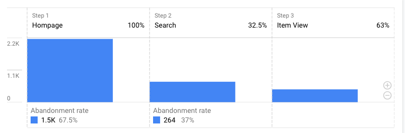
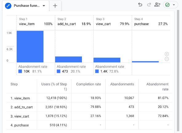
Example: How many visitors are dropping off on their purchase journey?
If you have implemented E-Commerce tracking with Google Analytics 4, then you are probably interested in knowing at what points in the purchase process users drop off. While funnel exploration cannot tell you why users are dropping off, it can provide insights that you can use to investigate areas of your site.
Add steps
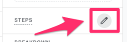
To get started, click the pencil icon next to “Steps”.
This will load a new view that allows you to identify the steps you want to follow for your funnel, which can be made up of a combination of events, parameters, or pages.
This funnel involves the use of e-commerce events, which requires additional configuration since these events are not automatically tracked by GA4. A complete GA4 ecommerce setup with Google Tag Manager is available in my Intermediate/Advanced GTM course.
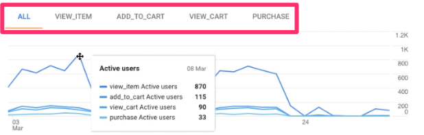
The steps for this funnel are: (this is just a guide, so feel free to adjust this to what works for you)
- Step 1: Event name exactly matches view_item
- Step 2: Event name exactly matches add_to_cart
- Step 3: Event name exactly matches view_cart
- Step 4: Event name exactly matches purchase
Add a breakdown
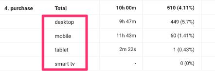
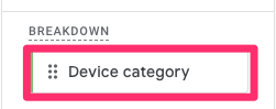
Add the Device category as a dimension and drag it into the “Breakdown” to see if any device-specific differences in the funnel need to be addressed.
Add the next action
Add Event Name as a dimension and drag it into the “Next action” to see the top five subsequent actions for each step.
Trended funnel and comparison
Let’s say we want to look at the trended funnel and compare the daily values for this year compared to last year.
Change the visualization from standard to trended. I will also remove the breakdown and the next action to simplify the visualization.
You can view each step in a single time series chart or change the tabs to view just a single step in the funnel.
To compare these values to the previous year, go to the date range, toggle on “Compare” and select the same dates as the last year.
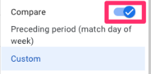
Now, for each day, you will be able to see the values for the current time period and the comparison time period to see how behavior has changed over time. This is especially helpful when you have made changes to your site and want to know the impact those changes have on users.
Note: Users are only attributed to the first date they were active in a step. So, if a user completed a purchase (and all previous steps) multiple times, they will only be counted once, and that would be on the date they first made a purchase in the time period.
You can also add up to 4 segments to your funnel exploration if you want to further compare multiple user groups at a time.
Path exploration
Path exploration is good if you don’t have a specific journey in mind and are just curious about what users are doing. These paths can help uncover unexpected behaviour and any looping that users may be experiencing.
Under the Settings tab, some components are unique to path explorations:
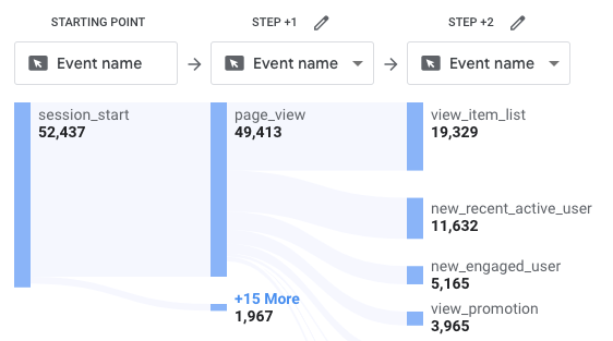
- Nodes: A node is a branch in the path exploration visualization. You can use four pre-defined dimensions for each step of the process and any combination of these dimensions across the path (you don’t need to stick to just one).
- View unique nodes only: When toggled on, this feature removes any nodes that appear after an identical node.
- For example, if a user’s actions are as follows: click > click > page_view (click events occur consecutively), then enabling only unique nodes will turn this into: click > page_view.
- Breakdown: Include an additional dimension, like the device category, to break down the visualization. You can view up to 5 rows of dimension values per node.
A couple more things to note are that the filter only allows for the use of “exactly matches” for dimensions and metrics, and only three metrics are available to be used as a value.
Example 1: What do users do after landing on your site?
You may have created a funnel that follows the steps you assume users are taking when they land on your site, but the funnel has shown significant abandonment rates, so you want to figure out where users are actually going – this is where path exploration shines.
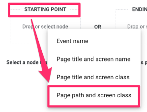
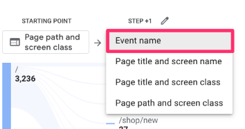
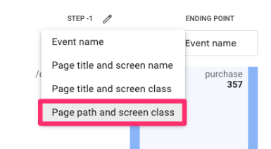
Click “Starting point”, select “Page path and screen class” and then find the page path that matches your site’s landing page. I find that the page title is not always the most reliable, so I prefer to use the page path.
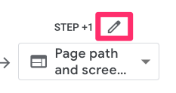
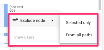
The data will begin to populate, and you may find that some (not set) page paths will appear. To remove any nodes you don’t want to include in the path exploration, click the pencil icon at the top and unselect the page path.
Here, you can also select the values you want included in the path since GA4 will select the top five by default. You can do this for each node individually.
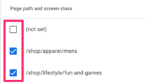
I prefer to remove the (not set) values since they don’t provide any insightful information, making the report look cleaner. You can also right-click on the node you wish to exclude and choose whether to exclude it from all paths or just the one.
You can change the node type at any point. For example, if you decide to examine the action a user completes after landing on your site’s homepage, you can change the node type to “Event name.” You don’t need to stick to just one node type across the exploration!
Continue clicking on the nodes you are interested in to build the path. There can be up to 10 columns in the visualization.
Additionally, add a breakdown to the path exploration to go a little deeper into the data. For example, you can add “Country” as a dimension and then drag that into “Breakdown”. This will show you the event count for each node broken down by the top five countries.
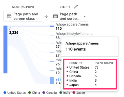
If you click on one of the values from the legend shown at the bottom, this will only highlight the path for that group.
Example 2: What did users do before making a purchase on your site?
Alternatively, the path exploration allows you to provide an ending point, so you can see the steps leading up to an action like, let’s say, a purchase. This type of report is helpful when you have unexpected results from a funnel exploration. You can plug in the final step of the funnel and see what users are actually doing before they reach this step.
This path exploration involves the use of e-commerce events, which requires additional configuration since these events are not automatically tracked by GA4. Learn more here.
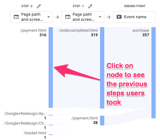
Click “Ending point”, select “Event name”, and then find the purchase event in the list.
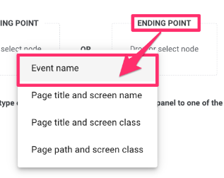
Data will now populate for the last and second last steps. You can select whether you want to see the previous steps as event names or page paths. I find that things can get a bit messy when you use the event name since there are a lot of auto-tracked events, like page views and clicks, that will appear, so I prefer to use the page path dimension.
You can choose to filter the nodes the same way as the previous exmaple. Continue to click on the node that you want to explore further (up to 10 columns total).
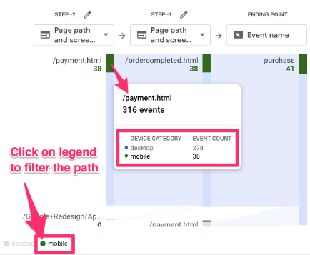
Add a breakdown by Device category to see the makeup of users for each step. You can click on a value in the bottom legen, like “mobile”, to filter the path to just users in that device category.
Segment overlap
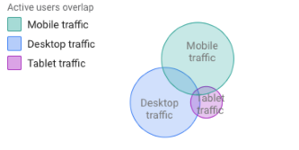
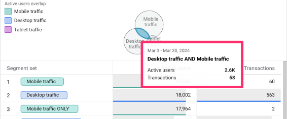
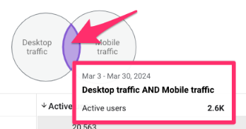
The segment overlap exploration in GA4 allows you to compare up to three user segments and identify commonalities and differences in behaviour between users in these segments. Essentially, it creates a Venn diagram to illustrate the connections between each group (while also providing the exact values for each section of the Venn diagram).
The one unique component in the Setting variable for segment overlap is Breakdown. As with the funnel and path explorations, this allows you to break down the report by a dimension of your choosing. However, you can have up to 500 rows for the dimension values in the segment overlap exploration.
Read this article on segments in GA4 to learn more about the different types of segments and which one you should use. Do this before trying to create a segment overlap report.
Example 1: Device category segments
Using the Mobile traffic and Desktop traffic segments from the Free-form exploration Example 2 and a new “Tablet traffic” segment, you can create a simple segment overlap to see the devices visitors use to get to your site.
This will only work if you have user ID enabled for cross-device tracking (otherwise, all users will appear to be in different segments with no overlap), so be sure to read more about that here.
Click the “+” next to Segments to create the new segment.

Click “User segment”.
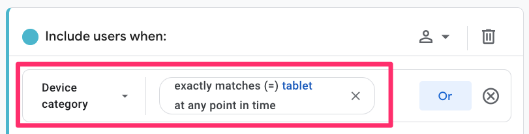
Add “Device category exactly matches tablet”, name the segment “Tablet traffic”, and click “Save and apply” (which will apply the segment to the report).
The Active users metric will always be present, but you can add an additional metric, such as Transactions or Sessions and drag it over to the Metrics.
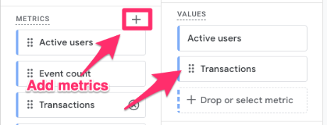
Now, you can see the values for both active users and transactions for each overlap of the segments in both the Venn diagram and a table.
Example 1.2: Verify your user ID implementation
An added bonus of the above report is that it’s a method of verifying your user ID setup. If there is no overlap between the different devices, then you know that something is wrong (since user ID tracking specifically allows for cross-device tracking).
If you have implemented a user ID setup, then pull in the Desktop traffic and Mobile traffic segments from above (if you did the above example, then you have this already). As long as there is an overlap (however small it may be), this tells you that your setup is working properly!
If you don’t have any overlap, it could be possible that you just don’t have enough data yet (if you just implemented the user ID), or there is something wrong with the tracking. Review this article on implementing user ID tracking, and if a developer helped you, talk with them about it.
The examples in this section—and most of the article—are simple but show the potential for uncovering some really interesting insights. Start simple, and then, naturally, you will begin to expand on your segments as you start to uncover different questions you want to answer.
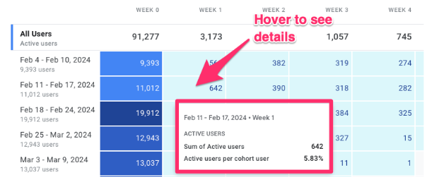
Cohort exploration
The cohort exploration in GA4 can help you get more insights into user retention. This technique will take all users (or just users that fit specific criteria) over a period and show you how many of them return to your site over the next few weeks or months. You can also specify conditions that need to be met for them to be included in the return cohort.
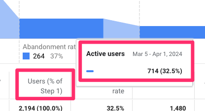
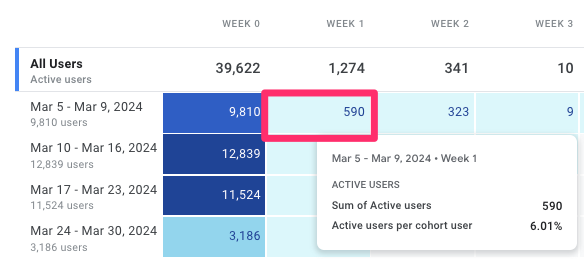
This may be easier to understand with an example. Using the image below, we can say that between March 5 and March 9, 9,810 users were in the initial cohort, and one week later, 590 fit the conditions to be included in the return cohort (6% of the initial group).
Some limitations to this report are that the data is based solely on the user’s device data and will not include user ID (even if you collect it), and there is a maximum of 60 cohorts.
The unique components of the cohort exploration are:
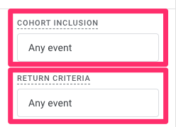
- Cohort inclusion: The initial criteria a user must meet for the cohort.
- Return criteria: The condition a user needs to meet after completing the initial criteria to be included in the returning cohort columns.
- Cohort granularity: Specifies the time range of the cohort columns, e.g., daily (midnight to midnight of property time zone), weekly (Sunday to Saturday), or monthly (beginning to end of the month).
- Calculation: The methods for including users in the cohorts
- Standard consists of all users who meet the return criteria for that period
- Rolling includes only users who meet the return criteria for that period and all previous periods.
- Cumulative includes users who meet the return criteria in any period.
Example: Does a new feature improve user retention?
Let’s say you make a big design of your site or launch a new feature at the start of the week. Cohort exploration will allow you to compare the retention of the users visiting your site that week with those who visited in the previous weeks to see if the change you made had a significant impact.
This cohort exploration is pretty simple. For the date range, select a few weeks before the change happened and at least a few weeks after the change happened. Set both the Cohort inclusion and Return criteria as “Any event”.
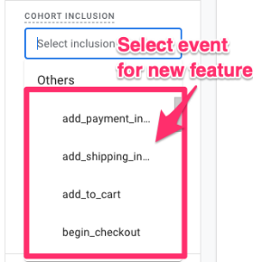
If you’re tracking the new feature with an event, you could also set the Cohort inclusion as this event. Then, you can see if the percentage of users returning to the site after interacting with the new feature is higher than in previous weeks.
Now, the cohort analysis will show you the number of users that completed any action (or the specific action you chose) in the Week 0 column (these are the users included in the initial cohort) and then for each week after, the number (and percentage) of those users who returned to your site and completed any action.
To investigate further, you could add the Device category to the breakdown to see if there are any differences between devices.
For example, the retention rate for mobile users may be much lower than that for desktop users, indicating a bug in your mobile redesign.
User lifetime
The User lifetime exploration in GA4 looks at the average values of some key metrics from the first time a user visited your site, broken down by various dimensions that mainly focus on the first-ever visit to your site, like the First user medium or Last audience name.
There are some important things to note for these reports:
- Data is only available for users who have been active on your site after August 15, 2020, and there is a sampling limit of one million users for the free version of Google Analytics 4 and 10 million for GA4 360 properties.
- When you choose a date range, keep in mind that the entire lifetime of any users active in the date range will be included (so this includes activity before the date selected), and you can’t change the end date (it’s auto-set to yesterday).
- If a User ID is collected on your site, this will be used (for more accurate data); otherwise, the client ID (for web) and app-instance ID (for app) will be used to identify users. Learn more about how to implement User ID for cross-device tracking here.
- The only dimensions available are: First user medium, First user source, First user campaign, Last audience name, and First visit date.
- The only metrics available are: Active users, Total users, and all the User lifetime metrics.
Example: Lifetime values by first user medium
This isn’t a report I use very often, but it is interesting to see if there are any noticeable differences in the lifetime metrics across different dimension values. In this case, we will see if there are any differences in metrics across the mediums users went through to land on your site for the first time.
One thing to note is that if you haven’t implemented User ID tracking, then this won’t be the most accurate report. Users who have cleared cookies or entered your site from a different browser (after their first visit) will now be counted again, with – potentially – a different medium.
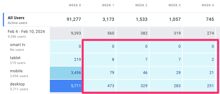
Once you have selected the “User lifetime” technique, the dimensions and metrics that can be used in the report will automatically load. You can still add some metrics, but the ones we need will already be available.
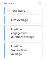
All you need to do is double-click on the First user medium under the dimensions, and the Total users, Lifetime transactions: Average, Lifetime engagement duration: Average, and LTV: Average (sum of revenue) for metrics.
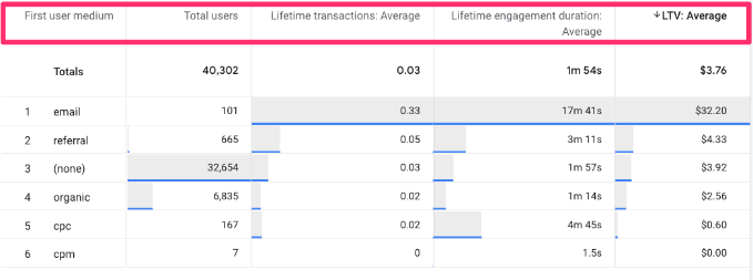
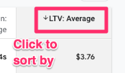
Click on one of the metric headers to sort the data in descending order to see the medium with the highest value for that metric.
The above results show that users who visited the site for the first time through email have the highest lifetime values, which is pretty neat!
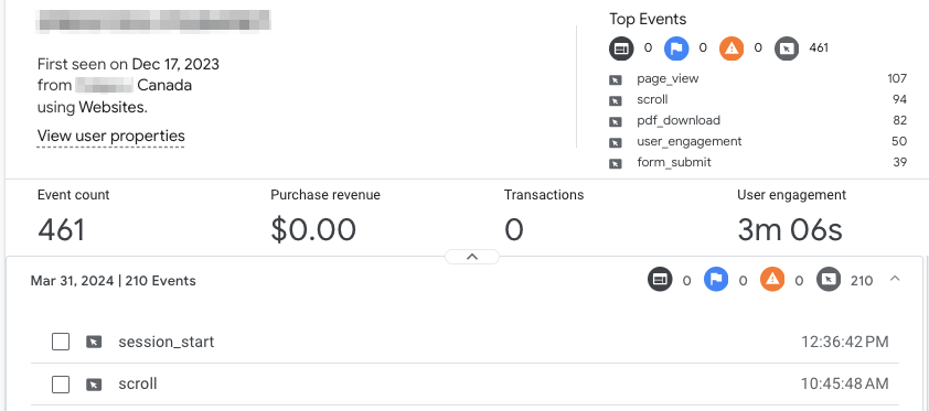
User explorer
The User Explorer exploration in GA4 provides a detailed view of an individual user’s interactions with your site. Again, this isn’t a report that I use very often, but it will have its place in some people’s analytics toolbelt.
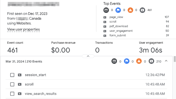
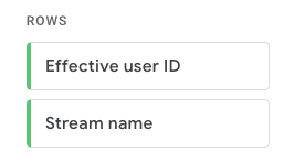
A unique component of this report is that there are only two available dimensions—effective user ID and stream name. The Effective user ID field will contain the client ID, app instance ID, or User ID. If you set your reporting identity to “By device only,” the User ID will not be displayed in this dimension (even if you are tracking it).
However, the metrics are less limited, and you can still capture quite a bit of information on the user.
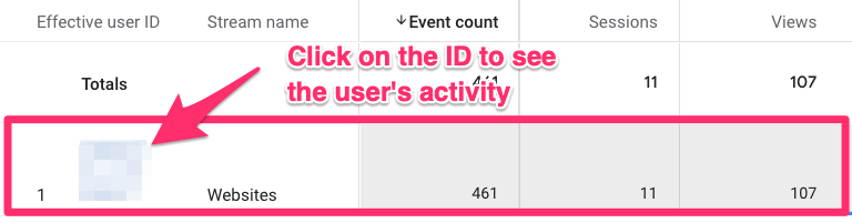
So, how can you use this technique? You can click on an individual in the table to examine their actions across multiple sessions.
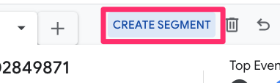
This report may be helpful for building out segments if you have specific patterns in individuals and want to explore them on a larger scale. Select the events you wish to include in a segment and click “Create segment”.
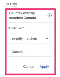
You can also use a filter to explore a user who has completed a specific action or lives in a particular location and see granular insights into user behaviour and preferences.
An individual user’s view (profile) is fairly limited (compared to what we had in UA). For example, it doesn’t show the URL for where an event happened.
Regardless, it may be worth clicking through a few individuals just to see if anything stands out. Let me know in the comments if there is a unique way that you use this report!
A Guide to Google Analytics 4 Explorations: Final Words
If you made it through this guide, congratulations! I hope this has provided a good overview of Google Analytics 4 Explorations, including the features, how to use the different techniques, and ways to leverage the most insights from your data.
It’s important to remember that there are many, many ways to use GA4 explorations, and they are in no way limited to the few examples covered in this article. Now is the time to dig into your marketing and analytics knowledge to come up with reports that will answer your business needs.
If you need a quick recap, here are the key takeaways:
- Explorations are for deeper, ad-hoc analysis that standard reports cannot handle.
- Free-form is your go-to for custom tables.
- Funnel exploration helps you find where users abandon a specific process.
- Path exploration allows you to see actual user journeys, including reverse paths from conversion.
- Segment overlap is excellent for auditing cross-device (User ID) tracking.
- Always remember to extend your data retention to 14 months to get the most out of these tools.
Remember that this was a road trip through analytics, not a race, so take in all the sights and sounds, try different things, and continue to explore your data in new ways.
If you have any hot tips or suggestions for Explorations in GA4, please leave them in the comments!
1 COMMENT
Is there any way to use an 'and' filter within the report filters section? For example I want to see visitors to page 'A' and page 'B' only. But there only seems to be a filter to see visitors to page 'A' not both?